Feature Grid Component - Copy this Html, Bootstrap Component to your project
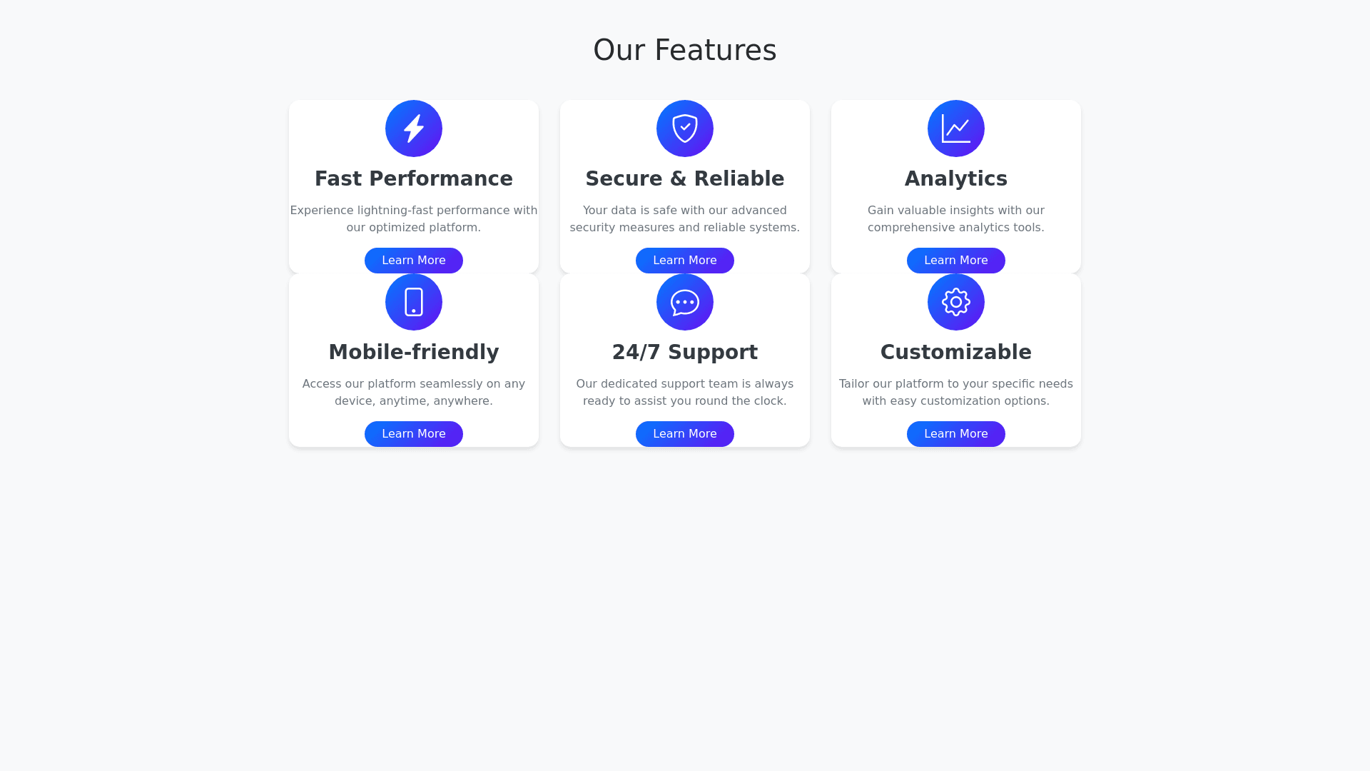
Design a modern and sleek user interface section that contains six feature cards arranged in a grid layout (3 columns by 2 rows). Each card should have a dark background with subtle gradients and rounded corners. The cards should include: A small, relevant icon or image at the top left corner. A bold title that clearly describes the feature. A short, descriptive subtitle below the title explaining the feature. Details: Use a consistent color scheme across all cards, with green accents for icons and key elements to make them stand out. Include small, subtle graphical elements (e.g., dots, lines, grids) in the background of each card to add depth. Ensure that the font is modern, readable, and contrasts well with the dark background. The entire section should have a seamless and cohesive look with enough padding around and between the cards to maintain clarity and balance.
