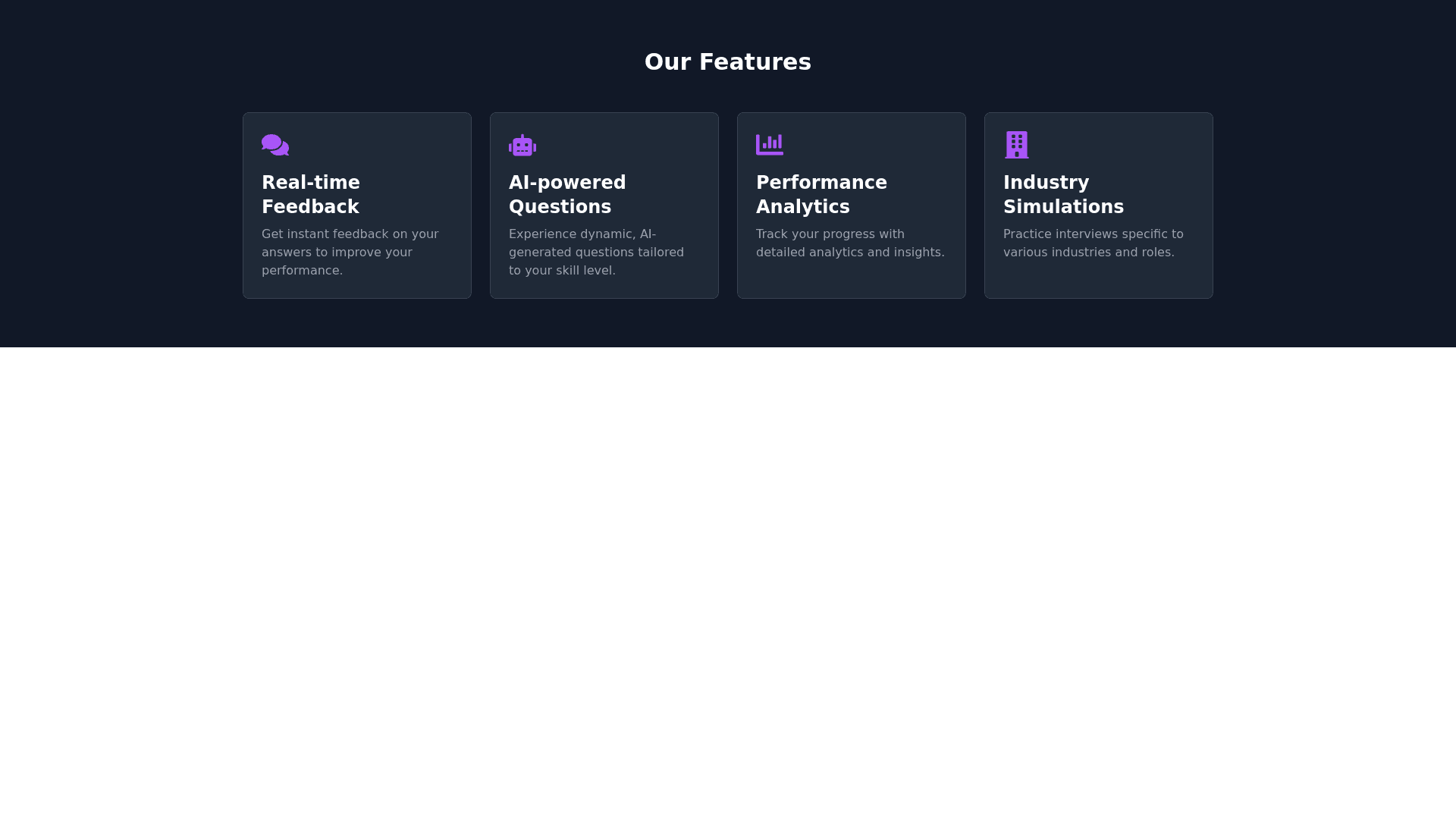
Feature Card - Copy this React, Tailwind Component to your project
Generate a dark themed Features component in React using Tailwind CSS with the following specifications: Content: Feature 1: 'Real time feedback on answers' with a relevant icon. Feature 2: 'AI powered question generation' with a relevant icon. Feature 3: 'Detailed performance analytics' with a relevant icon. Feature 4: 'Simulate interviews for different industries' with a relevant icon. Layout: Use a responsive grid layout (grid grid cols 1 md:grid cols 2 lg:grid cols 4 gap 6). Each feature card should have an icon, title, and a short description. Design: Background: bg gray 900 Each card: Background: bg gray 800 Padding: p 6 Rounded corners: rounded lg Icon: text purple 500 text 4xl mb 4 Title: text white text 2xl font semibold Description: text gray 400 mt 2 Hover effect: On hover, each card should have a subtle scale up (transform scale 105) and a shadow (shadow xl transition transform). Add a subtle border around each card: border border gray 700. Responsive: Ensure the grid adjusts for smaller screens (1 column on mobile, 2 on tablets)."
