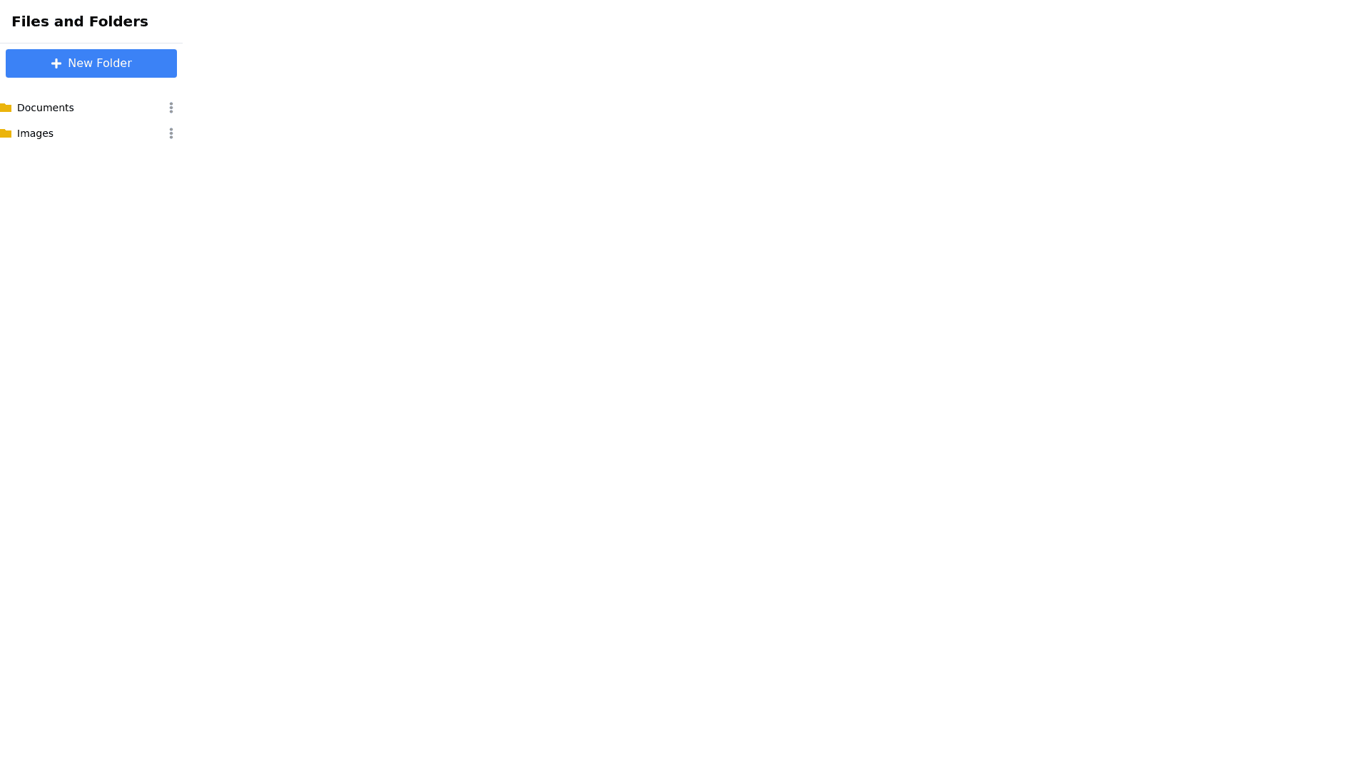
File Item - Copy this React, Tailwind Component to your project
Prompt for Generating a File and Folder Management Sidebar Component: Component Overview: Create a React sidebar component using Material UI that closely replicates the provided UI image. The sidebar should include a top bar with a "New File" button and a folder icon button, followed by a list of folders and files. The entire sidebar component should be highly responsive and maintain visual consistency across various screen sizes. Styles: Sidebar Container: A dark theme with a black background (#000000). Structure the sidebar into a top bar (for buttons) and a content area (for folders and files). Ensure the sidebar occupies the full height of the container, with the content area scrollable if content overflows. Top Bar: Positioned at the top of the sidebar, horizontally aligned. "New File" Button: Displays a "+" icon followed by "New File". White background (#FFFFFF) with black text (#000000). Rounded corners, with padding to ensure consistent button height. Flex grow property is used so that this button fills the remaining horizontal space. On click, it should trigger a modal or dialog box for creating a new file (details below). Folder Icon Button: A square icon button displaying a folder icon with a "+" symbol, positioned to the right of the "New File" button. Same height as the "New File" button but does not grow, maintaining a square aspect ratio. White background (#FFFFFF) with black icon (#000000). Rounded corners to match the "New File" button. On click, it should trigger a modal or dialog box for creating a new folder (details below). Folder and File List: Folders: Displayed as expandable items with a chevron icon on the left. Bold white text, using the Material UI Typography component with font weight font weight: 500;. Clicking on a folder expands or collapses the view, revealing or hiding nested files and subfolders. Files: Displayed as items with a file icon and file name. Text color is white, and the name is truncated with ellipsis if it exceeds available space. The icon should precede the file name and be left aligned. On click, each file should trigger an action, such as opening the file in a new tab or starting a download. Functionalities: "New File" Button: Opens a modal or dialog box for creating a new file via: File Upload: Users can upload files from their local machine. The system should handle file validation and display errors if necessary. Custom Text File: Users can enter a filename and manually input the content for the text file. The file is then added to the file list. Folder Icon Button: Opens a modal or dialog box for creating a new folder. Users input a folder name, and upon confirmation, the new folder is added to the folder list. Folder and File List: Folders: Can be expanded/collapsed to show or hide their contents. Support for nested subfolders. Upon expansion, any nested folders or files are shown with appropriate indentation. Files: Each file in the list can be opened or downloaded by clicking on it. Includes drag and drop support for rearranging files within the folder hierarchy. Data Structure: File Data: id, name, type, content, size, createdAt. Folder Data: id, name, items (array of file or subfolder IDs), createdAt. Additional Requirements: Responsiveness: Ensure the sidebar adjusts its layout properly across different screen sizes and orientations. The component should be fully functional on both desktop and mobile devices. Error Handling: Provide user friendly messages for any errors encountered during file upload, creation, or folder management. Accessibility: Use ARIA labels and support keyboard navigation to ensure the component is accessible to all users.
