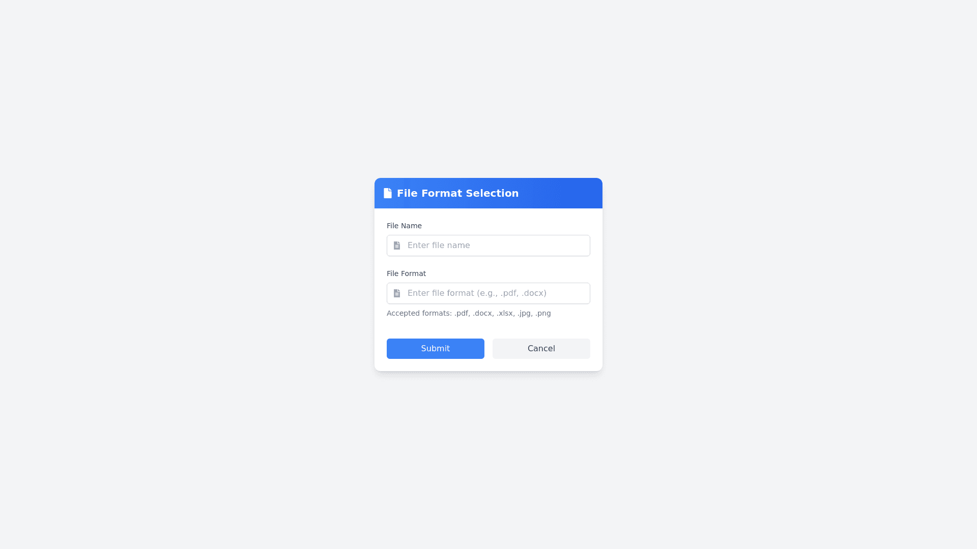
File Format Selection - Copy this React, Tailwind Component to your project
Design a modern and clean file format selection form card where the user can manually type the file format, and if the input matches valid formats, the backend will process it. The form should include the following elements: Card Layout: General Design: A centered card with a sleek and professional look, featuring rounded corners, soft shadows, and a subtle gradient or neutral background color. Keep the card dimensions compact, yet spacious enough for a neat and clear layout. Header: A bold header at the top labeled "File Format Selection", paired with an optional icon (e.g., a file icon) for added visual appeal. Form Elements: File Name Input: A labeled text input field at the top with the label "File Name". Add a placeholder, e.g., "Enter the file name". Optionally include an icon within the input field (e.g., a document icon) to enhance the user experience. File Format Input: A labeled text input field below the file name with the label "File Format". The placeholder text should guide the user, e.g., "Enter the file format (e.g., .pdf, .docx, .png)". Add input validation feedback (e.g., red border with error text if the file format doesn’t match predefined formats). An optional helper text below the input field can list examples of valid file formats (e.g., "Accepted formats: .pdf, .docx, .png, etc."). Buttons: Submit Button: A prominent "Submit" button styled in a primary color (e.g., blue or green) with hover effects (e.g., color shade change or slight elevation). Cancel Button: A secondary "Cancel" button styled in a neutral or warning color (e.g., gray or light red) to let users exit the card. Alignment: Buttons should be horizontally aligned at the bottom of the card with proper spacing. Design Details: Use modern fonts with clear and legible text sizes. Add hover and focus effects to all inputs and buttons to make the design interactive. Ensure consistent spacing, padding, and alignment for a polished look. Optional: Add a small animation for the card's appearance (e.g., fade-in or slide-in effect). Responsive Design: Ensure the card is responsive for various screen sizes: On smaller screens, stack the inputs and buttons vertically with adequate padding and spacing.
