Dashboard Layout - Copy this React, Tailwind Component to your project
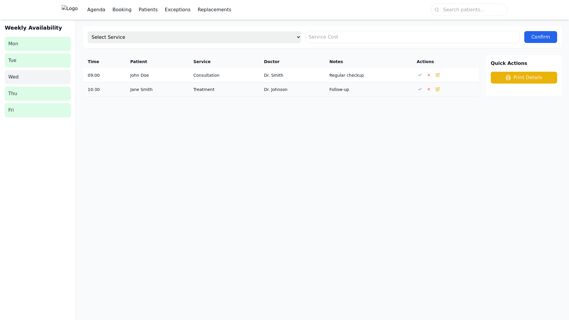
Create a 1. Header Component (Fixed Navigation Menu) Description: Position: A fixed bar at the top of the page, remaining visible even when scrolling. Content: Includes the logo on the left, the main navigation menu with the following sections: Agenda, Booking, Patients, Exceptions, Replacements. On the right side of the bar, add a search field to quickly find patients by name. Design: Use the primary color (#3b82f6) for the navigation menu and the text in the foreground color (#111827) for high contrast. The search bar should have a rounded design with a search icon inside or on the right side. 2. Sidebar Calendar Component Description: Position: On the left side of the screen. Content: Displays a weekly calendar that shows doctors' availability with indicators for the number of free and occupied slots per day. Design: Utilize the secondary color (#34d399) to mark available days, and use the accent color (#eab308) for highlighting important dates or critical conditions. 3. Selection Component Description: Position: In the central area, at the top, below the fixed header. Content: Contains a dropdown menu for selecting the required service (e.g., consultation, examination), an input field for entering the service cost, and buttons for choosing payment options or tickets. Design: Buttons should use the primary color (#3b82f6) with medium text size (16px) and rounded corners for a clean look. 4. Central Table Component Description: Position: In the center of the page, below the Selection Component. Content: Displays a scrollable table that lists all daily bookings, with columns for time, patient name, service type, doctor, and notes (such as absences or cancellations). Design: The table should be responsive, allowing easy viewing on different screen sizes. Use alternating row colors with a light background (#f3f4f6) for better readability. Column headers should be in semi bold to create a visual hierarchy. 5. Quick Actions Component Description: Position: Adjacent to the central table. Content: Includes buttons to mark bookings as occupied, indicate patient absence, or make modifications. Design: Buttons should be color coded based on action type (green for confirm, red for cancel, yellow for modify) with intuitive icons. 6. Sidebar Actions Component Description: Position: On the right side of the central area. Content: Contains tools for updating booking numbers and includes a button to print patient details. Design: Print buttons should be highlighted with the accent color (#eab308) for visibility, using clear and accessible text. Design Details for PureCode IA Font: Use "Inter" for all text, with the following sizes: Main Titles: 22 24px, Bold Section Headers: 18 20px, Semi bold General Text: 14 16px, Regular Small Notes: 12 14px, Light Colors: Apply the custom “mytheme” with the following colors: Primary: #3b82f6 (blue) for main buttons and links. Secondary: #34d399 (green) for availability indicators and success states. Accent: #eab308 (yellow) for critical elements. Background: #f3f4f6 (light gray). Text: #111827 (dark gray).