Dashboard Layout - Copy this React, Tailwind Component to your project
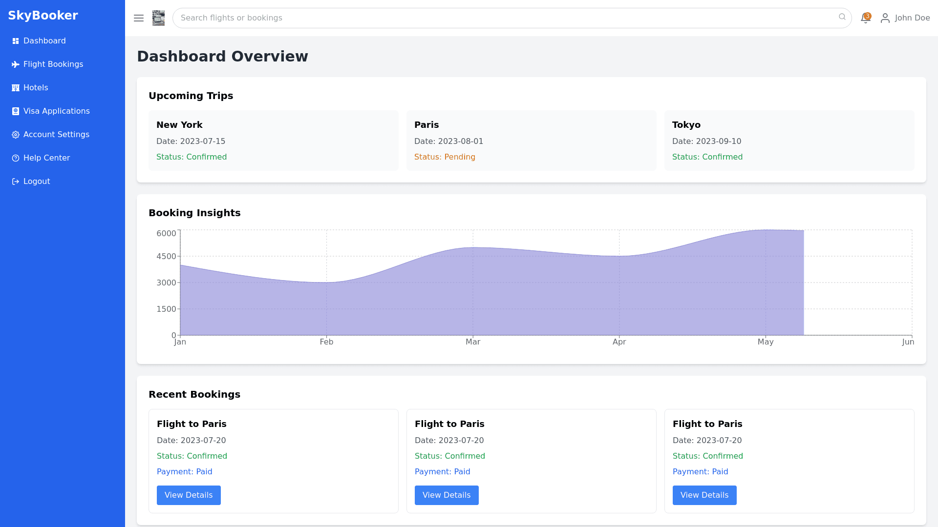
The modern dashboard layout for a flight booking system is designed with a clean, responsive, and user centric approach. At the top of the page, the header contains a left aligned logo, a center search bar for quick access to flights or bookings, and a right aligned profile icon with a dropdown for account settings, notifications, and logout options. The notification bell, also positioned on the right, alerts the user to pending payments or offers, highlighted by a badge for emphasis. On the left, there is a collapsible sidebar that adapts based on the screen size. On desktop, the sidebar provides full navigation with sections like Dashboard Overview, Flight Bookings, Hotels, Visa Applications, and Account Settings, along with secondary sections like Notifications, Help Center, and Logout. On smaller screens, this sidebar reduces to icons or a hamburger menu, enhancing the mobile experience while keeping the design minimal and functional. In the main dashboard panel, the top section displays an overview of the user’s upcoming trips, including a summary of booked flights with dates and statuses, arranged in a horizontal, scrollable format. Visual elements such as graphs or charts provide insights into booking history, cancellations, or payment statuses. Below the overview, the booking section is laid out with interactive cards, each representing a specific flight or trip. These cards contain essential information, such as the flight route (e.g., Dhaka → Cox’s Bazar), booking status (e.g., Confirmed or Cancelled), and payment status (e.g., Paid or Unpaid). Each card also features a prominent “View Details” button for users to access more detailed flight information. On smaller devices, the dashboard reorganizes into a single column format, ensuring a smooth experience across all screen sizes while maintaining the same level of interactivity and information hierarchy