Header - Copy this React, Mui Component to your project
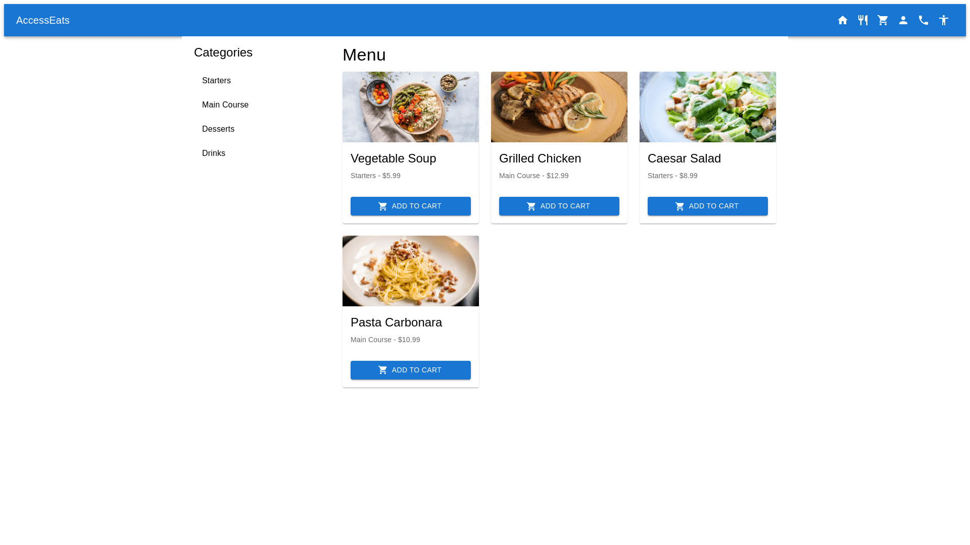
Design a fully accessible and responsive web based food ordering system with a user friendly interface for all, especially for users with physical disabilities (visual, motor, and cognitive challenges). The design will follow WCAG 2.1 guidelines, featuring a minimalistic, clean, and professional approach with large fonts, high contrast, and simple navigation. 1. General Layout Header: Logo on the left, navigation bar with Home, Menu, Cart, Profile, and Contact. Include icons, keyboard navigable. Prominent "Accessibility Settings" on the top right. Main Content Area: Categories Sidebar: Large, collapsible, and keyboard accessible categories (Starters, Main Course, etc.). Food Menu: Grid format, each card featuring an image, name, description, price, text to speech button, and large "Add to Cart" button. Voice command and keyboard shortcuts enabled. Footer: Contact info, social media links, Terms, and About Us. Fully keyboard accessible. 2. Accessibility Features Voice Commands & Text to Speech: Voice command microphone for search and menu categories (e.g., "Find vegetarian dishes"). Text to speech for food descriptions and order feedback. Screen Reader Compatibility: Descriptive ARIA labels, alt text for images, and accessible interactive elements. Keyboard Navigation: Full keyboard operability for navigation, selection, and ordering. 3. Visual Design Color Contrast: High contrast (minimum 4.5:1). Font Sizes: Default 18px, adjustable via Accessibility Settings. Dark Mode: Toggle option for users with light sensitivity. 4. Shopping Cart & Checkout Cart: Expandable, large buttons for "Checkout" and "Remove/Adjust Quantity." Checkout Page: Accessible payment options, address input, and delivery instructions. Clear, accessible error messages with voice feedback. 5. Additional Accessibility Tools Accessibility Toolbar: Floating toolbar with options to adjust font size, color contrast, text to speech, and a keyboard navigation guide. 6. Error Handling & Feedback Voice feedback for actions (e.g., "Item added to cart"). Clear error messages for failed actions with high contrast and voice support. 7. Mobile & Tablet Responsiveness Responsive design with touch friendly, large buttons. Gesture based navigation on mobile (e.g., swipe to browse categories). Design Summary: Responsive, accessible design with keyboard navigation, screen reader support, and voice commands. Adjustable font sizes, high contrast, dark mode. Voice feedback for actions and errors. Fully accessible shopping experience with clear, large buttons and responsive mobile design.