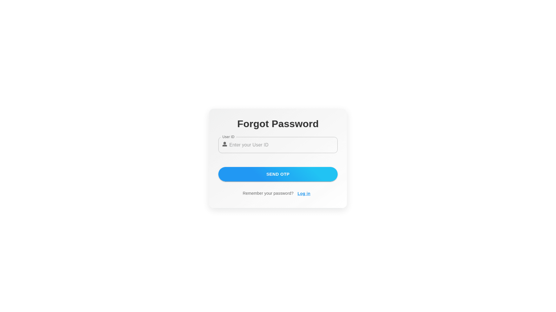
Styled Paper - Copy this React, Mui Component to your project
Import React, { useState } from 'react'; import { Container, Typography, Paper, TextField, Button, Box, Grid } from '@mui/material'; function ForgotPasswordUserID({ fieldType }) { const [inputValue, setInputValue] = useState(''); const handleChange = (event) => { setInputValue(event.target.value); }; const handleSendOTP = () => { // Logic to send OTP console.log(`Sending OTP to ${inputValue}`); }; const handleCancel = () => { setInputValue(''); }; return ( <Container component="main" maxWidth="xs" style={{ marginTop: '20px' }}> <Paper elevation={3} style={{ padding: '16px', borderRadius: '8px' }}> <Typography variant="h5" align="center" style={{ marginBottom: '16px' }}> Forgot Password </Typography> <Grid container spacing={2} alignItems="center"> <Grid item xs={4}> <Typography variant="body1" style={{ color: 'black' }}> {fieldType === 'userid' ? "Email ID" : "User ID"} </Typography> </Grid> <Grid item xs={8}> <TextField variant="filled" fullWidth value={inputValue} onChange={handleChange} required InputLabelProps={{ sx: { color: 'black', '&.Mui focused': { color: 'black', }, }, }} InputProps={{ sx: { backgroundColor: 'white', borderRadius: '4px', }, }} /> </Grid> </Grid> <Box style={{ display: 'flex', justifyContent: 'space between', marginTop: '20px' }}> <Button variant="contained" color="primary" onClick={handleSendOTP}> Send OTP </Button> <Button variant="outlined" color="primary" onClick={handleCancel}> Cancel </Button> </Box> </Paper> </Container> ); } export default ForgotPasswordUserID; make this components design more elegant and beautiful