Modern Form Capturer - Copy this Html, Tailwind Component to your project
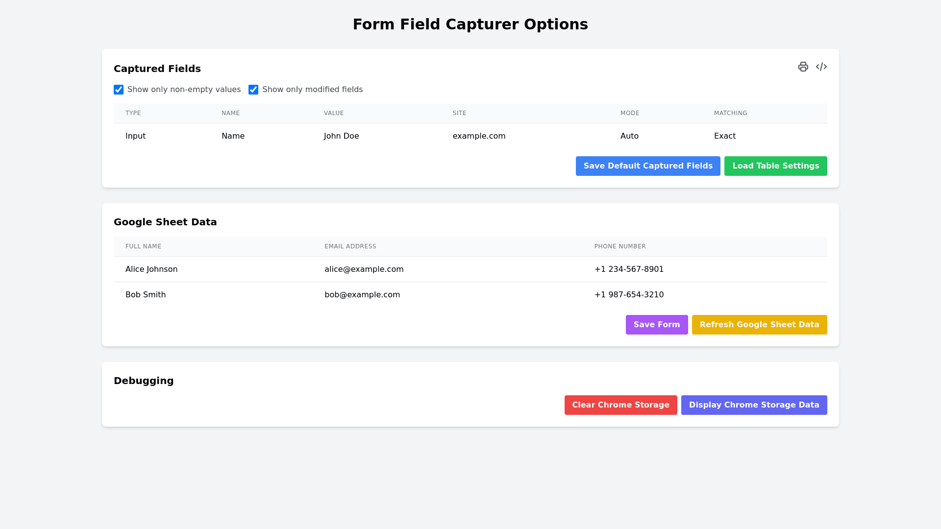
The current UI is titled "Form Field Capturer Options", which is centered and bold at the top of the page. Below the title, there is a section labeled "Captured Fields". Next to this heading, there are two functional icons: a printer icon for printing the page and a code icon to display the code. Underneath this heading, there are two checkboxes that are checked by default: Show only non empty values and Show only modified fields. A table is displayed in this section to show the captured fields, containing six columns: Type, which describes the type of field (e.g., Text, Email, Phone); Name, which is the field name (e.g., Full Name, Email Address); Value, showing the actual data captured (e.g., "John Doe," "john.doe@email.com"); Site, indicating the website the data was captured from (e.g., "example.com"); Mode, which specifies how the data was captured (e.g., "Capture"); and Matching, which indicates the matching strategy used (e.g., "Exact" or "Fuzzy"). Below this table, there are two buttons labeled Save as Default Captured Fields and Load Table Settings. Following this, there is a section called "Google Sheet Data". It contains a table with three columns: Full Name, Email Address, and Phone Number. The table includes some dummy data, such as "Jane Smith," "jane.smith@email.com," and "+60198765432" in the first row, followed by "Ahmad bin Abdullah," "ahmad.abdullah@email.com," and "+60167890123" in the second row. Below this table, there are two buttons labeled Save Form and Refresh Google Sheet Data. Lastly, there is a "Debugging" section at the bottom of the page, which includes two buttons: Clear Chrome Storage and Display Chrome Storage Data. In terms of design improvements, the layout can be modernized by improving the spacing, padding, and alignment of each section to create more breathing room. The typography can be enhanced by using modern fonts and adjusting the font sizes for improved readability. The table design can be updated by adding hover effects for table rows and improving the appearance of table headers, such as using bold text, larger fonts, or background color changes. The icons next to "Captured Fields" should have tooltips for better clarity and accessibility. The buttons can be made larger and more prominent, with hover and active states, such as color changes or shadow effects, to make them stand out more. A modern color palette, perhaps with a soft background and contrasting buttons, can improve the overall look and feel. Finally, the different sections can be visually separated using card like dividers or subtle shadow effects, which would result in a cleaner and more modern UI design. overall i need the page to be modern and elegant, using the tailwind's specialty