User Details Form - Copy this Html, Tailwind Component to your project
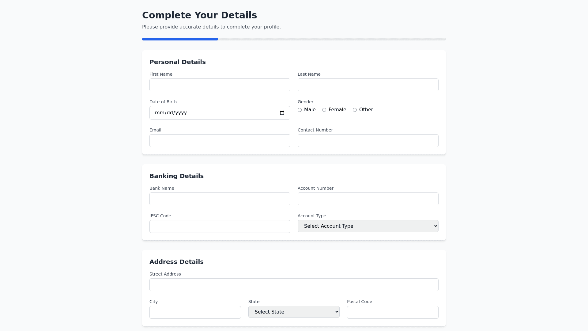
Design a professional and user friendly Form Fill Up Page for collecting comprehensive details in a structured manner. The form should be divided into four sections with a clean and intuitive layout. Include the following elements: 1. Page Layout Title: Add a prominent page heading like "Complete Your Details" to guide the user. Subtext: Include a short description such as "Please provide accurate details to complete your profile." Form Sections: Divide the form into four clearly labeled sections: Personal Details Banking Details Address Details Upload Documents Include a Submit button at the end and a Save Progress button for users to save incomplete forms. 2. Section Details 1. Personal Details Section Fields: First Name (required, text input) Last Name (required, text input) Date of Birth (DOB) (required, date picker) Gender (required, radio buttons: Male, Female, Other) Religion (optional, dropdown menu) Email (required, email input) Contact Number (required, number input with validation for mobile numbers) Styling: Arrange inputs in two columns for desktop screens and stack vertically on mobile. 2. Banking Details Section Fields: Bank Name (required, text input) Account Number (required, text input) IFSC Code (required, text input with format validation) Account Holder Name (required, text input) Account Type (required, dropdown: Savings, Current) Validation: Add real time validation for mandatory fields (e.g., account number format). 3. Address Details Section Fields: Street Address (required, text input) City (required, text input) State (required, dropdown menu with a list of states) Country (required, dropdown menu with prefilled countries) Postal/ZIP Code (required, number input) Feature: Autofill city and state based on postal code (optional). 4. Upload Documents Section Mandatory Uploads: Aadhar Card (file input, required) PAN Card (file input, required) Optional Uploads: Provide a button to add other documents dynamically: Name of Document (text input) Upload File (file input) Allow multiple additional uploads with a limit on the number of documents. Validation: Display file size and type restrictions (e.g., PDF, JPG, max size 5MB). 3. Additional Features Real Time Validation: Highlight errors below inputs (e.g., "Please enter a valid email address"). Progress Indicator: Show a progress bar at the top (e.g., 25%, 50%, etc.) as users complete each section. Responsive Design: Ensure proper alignment and usability on both desktop and mobile devices. Save & Resume: Provide an option to save form progress and resume later. Tooltips: Add tooltips for fields with detailed explanations (e.g., IFSC Code, PAN Card). Confirmation Message: On successful submission, display a message like: "Thank you! Your details have been submitted successfully." Styling and Design Layout: Clean and organized, use collapsible sections for each form part to enhance user experience. Color Scheme: Subtle colors like white, gray, and blue for professionalism. Buttons: Rounded and hover effects for interactivity. Typography: Clear and readable fonts like Roboto or Open Sans.
