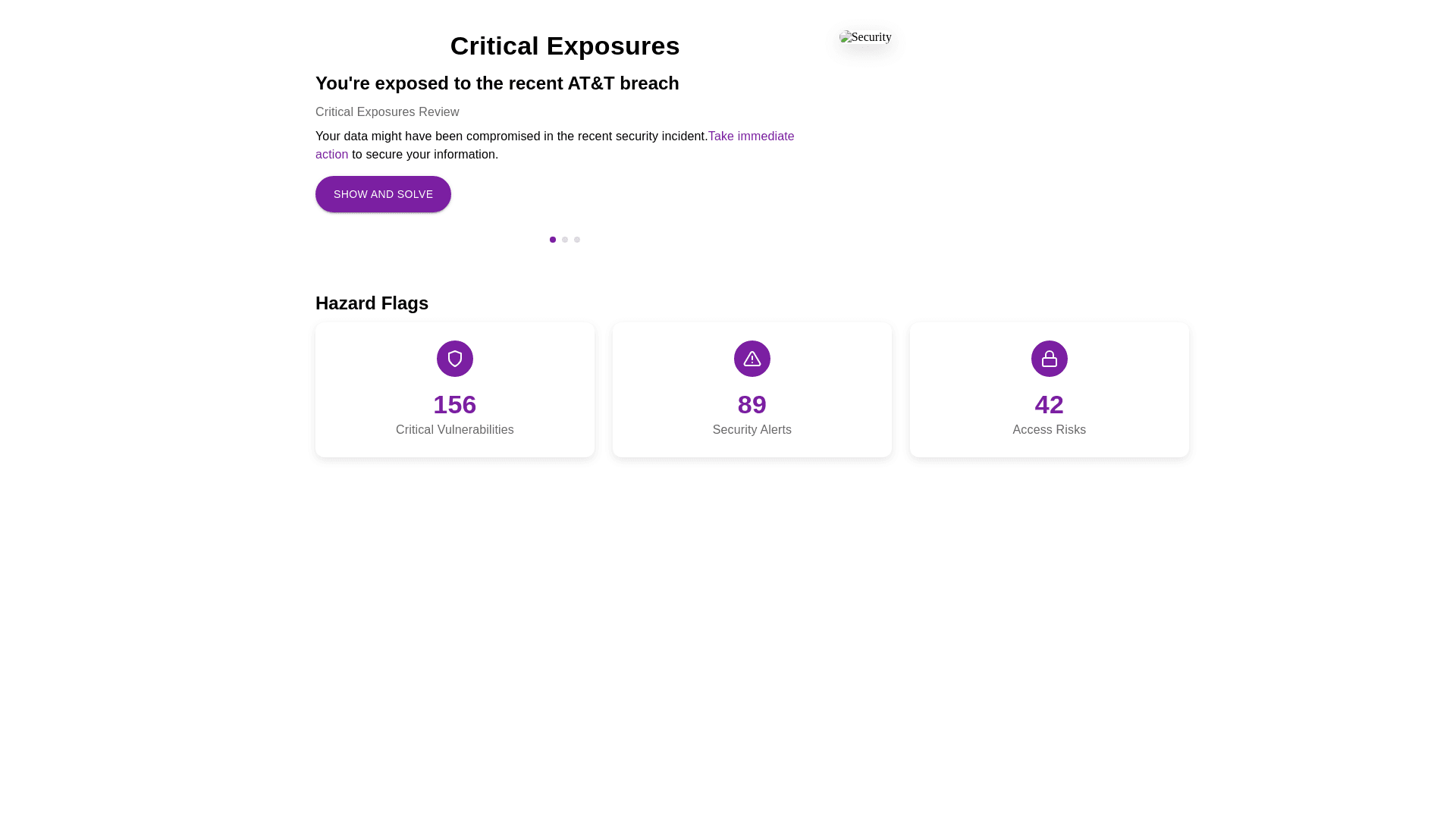
Styled Section - Copy this React, Mui Component to your project
General Layout 1. The layout is a two section structure: • Top Section (Critical Exposures): Contains a heading, details about the breach, and two columns (text and image). • Bottom Section (Hazard Flags): Displays three horizontally aligned hazard cards with icons, numbers, and labels. 2. Spacing and Margins: • Ample vertical space between the two sections. • Consistent padding around individual elements for clean separation. 3. Colors: • Primary color: Purple for emphasis (e.g., buttons, highlighted text, icons). • Text uses a mix of black, gray, and purple depending on emphasis. 4. Typography: • Titles: Bold, large font. • Subtitles and descriptions: Smaller but readable with varied weights (bold for emphasis). • Numbers on hazard cards are larger, bold, and in purple. op Section: Critical Exposures 1. Title: • Large heading: “Critical Exposures” at the top. • Center aligned and bold. 2. Details Block: • Left Column (Text): • Title: “You’re exposed to the recent AT&T breach” (bold, slightly smaller than the section title). • Subtitle: “Critical Exposures Review” (smaller, gray). • Description: Details about the breach in smaller font, with parts of the text (like “183 occurrences…”) highlighted in purple. • Button: A purple “Show and Solve” button, rounded corners, medium size. • Pagination: Small dots and numbering indicating a carousel like feature. • Right Column (Image): • Displays a 1:1 ratio image with a shadow effect. • Aligns visually with the left column’s top. 3. Borders and Separation: • Subtle horizontal dividers or enough space between sections. Bottom Section: Hazard Flags 1. Structure: • A title (“Hazard Flags”) above three cards aligned horizontally. • Each card has: • Icon: A purple circular background with a white icon inside (e.g., rotation arrows, globe, star). • Number: Large, bold, purple (e.g., “1K”, “453”, “430”). • Description: Smaller text under the number (e.g., “Unrotated”). 2. Card Design: • Slightly rounded corners. • Light borders or subtle shadow. • Equal spacing between the three cards. 3. Spacing: • Vertical space separates the title from the cards. • Equal gaps between cards horizontally. Component Sizes and Proportions 1. Grid Columns: • Top section is split into two grid columns: • Left column: Approximately 60% width. • Right column (image): Approximately 40% width. • Bottom section cards: Equal 1/3 width distribution. 2. Spacing: • Horizontal gap between top section columns: Around 16px. • Vertical gap between sections: Around 32px. 3. Typography Sizes: • Title (Critical Exposures): 20px+, bold. • Subtitle: Around 14px, gray. • Highlighted numbers (e.g., “183 occurrences…”): 16px, bold, purple. 4. Button: • Medium sized, rounded corners. • Padding: Around 12px 24px. 5. Pagination Dots: • Small, aligned to the bottom of the top section. • Active dot is purple, inactive dots are gray.
