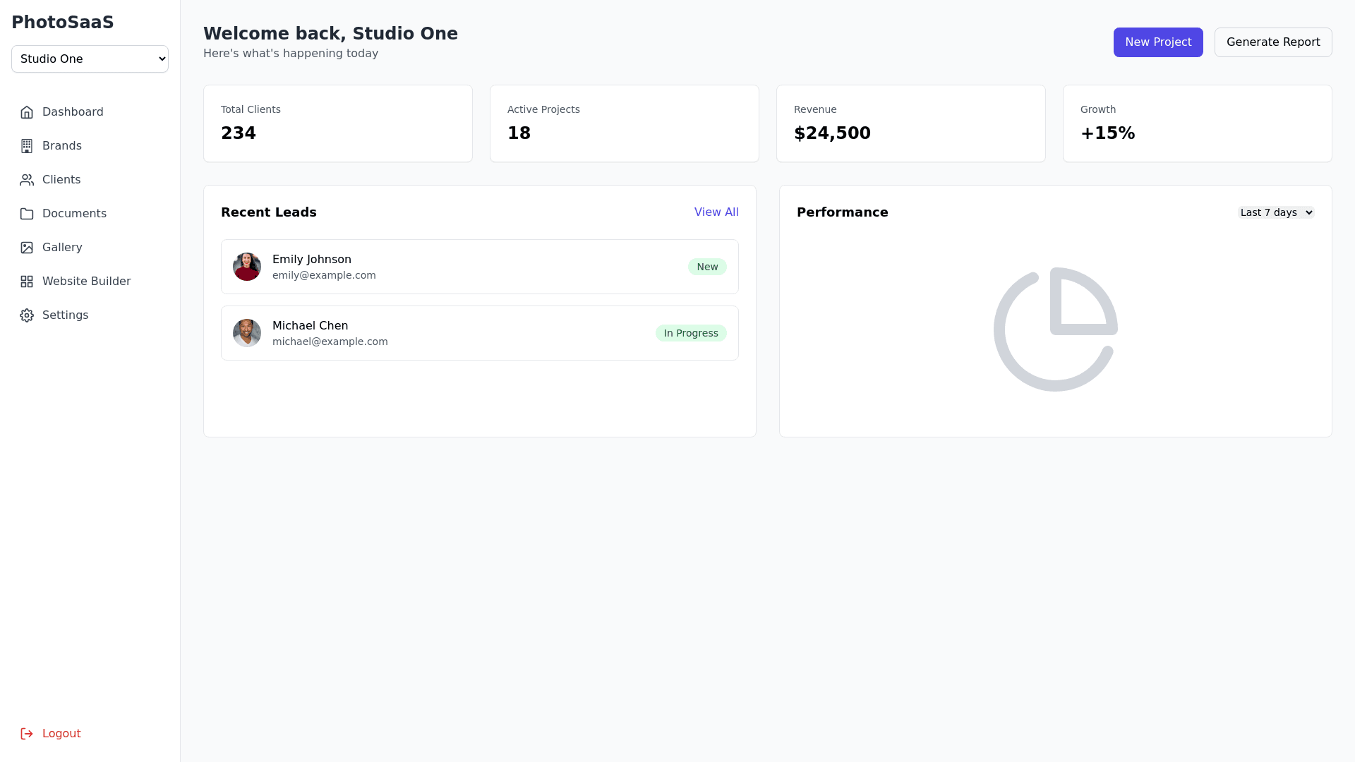
Default Component - Copy this React, Tailwind Component to your project
1. **Glassmorphism** - Panels, modals, or cards with semi-translucent backgrounds (`white/70` for light, `#131314/90` for dark), mild backdrop blur, subtle shadows. 2. **Color Palette** - **Primary**: `#86C8BC` (Mint) - **Background**: White in Light mode, near-black in Dark mode. - **System Grays** and **Shadows** for glass effect. 3. **Typography** - **Headings**: "Nunito" - **Body**: "Cormorant" - **UI**: "Inter" 4. **Dark/Light Mode** - Toggle in top bar. Tailwind classes or a small library. 5. **Responsive** - Collapsible **sidebar** on mobile, glass top bar, fluid layout for dashboards. --- ## 3. i18n (English/Italian) - Use `react-i18next` or a similar approach, storing strings in `locales/en/*.json` and `locales/it/*.json`. - Key points: - Localize date/time/currency for brand’s chosen locale. - Potential to expand more languages if needed. - Example snippet in `en/common.json`: ```json { "hello": "Hello", "dashboard": "Dashboard", "submit": "Submit" }
