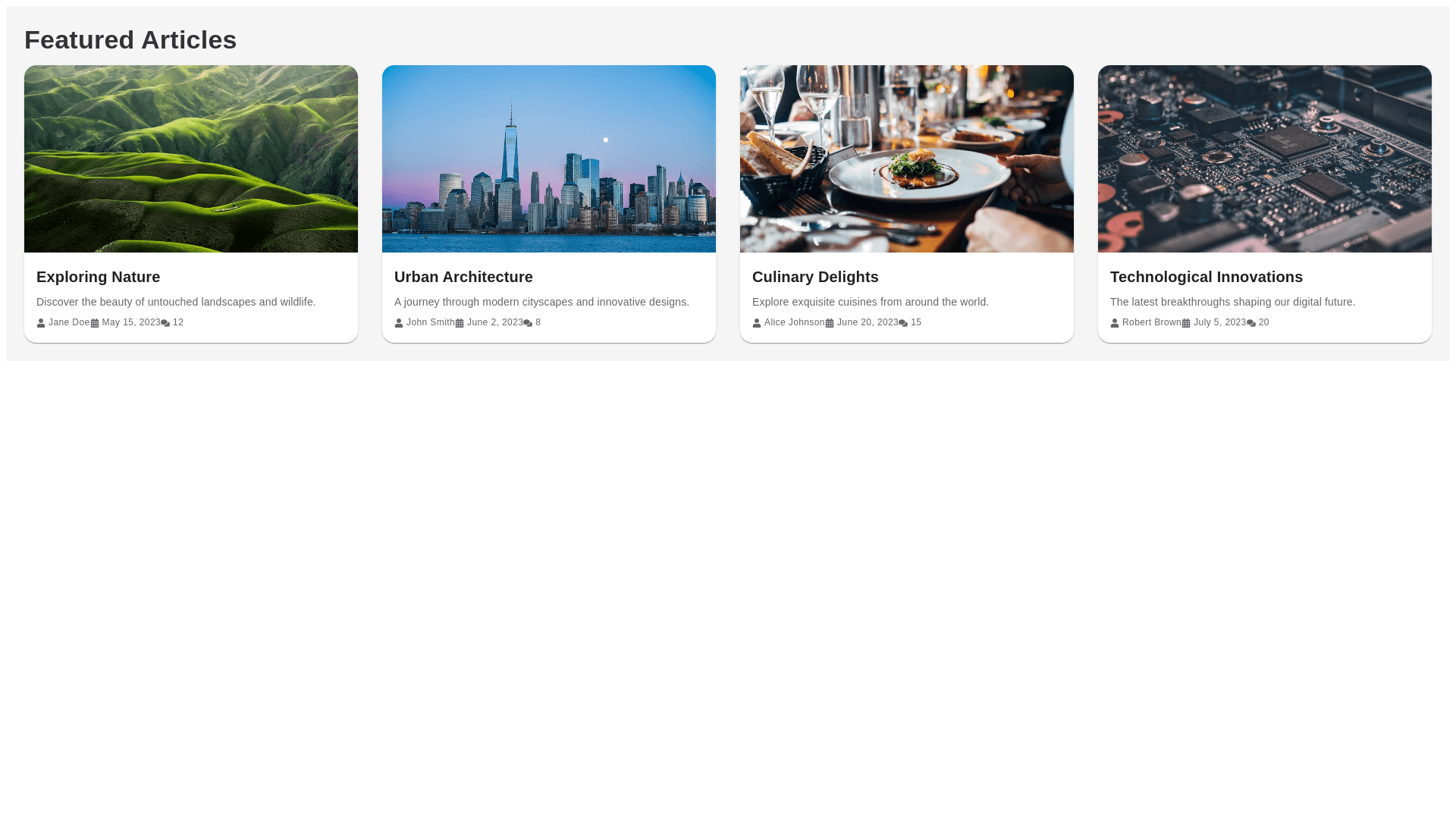
Styled Card - Copy this React, Mui Component to your project
"use client"; import React from "react"; import { Card, CardContent, CardMedia, Typography, Box } from "@mui/material"; import StarIcon from "@mui/icons material/Star"; import { menPlaceholderImg } from "@/common/utils"; const GridComponent = ({ data }) => { return ( <Box sx={{ display: "grid", gridTemplateColumns: "repeat(auto fill, minmax(260px, 1fr))", gap: 2, // Adjust gap between grid items justifyContent: "center", padding: 2, mt: 4, }} > {data.map((item, index) => ( <Card key={index} sx={{ width: "100%", maxWidth: 260, borderRadius: 2, boxShadow: 3, transition: "transform 0.3s ease, box shadow 0.3s ease", "&:hover": { transform: "scale(1.03)", boxShadow: 6, }, cursor: "pointer", }} > <CardMedia component="img" image={item.photoURL || menPlaceholderImg} alt={item.name} sx={{ borderTopLeftRadius: 2, borderTopRightRadius: 2, height: 300, }} /> <CardContent sx={{ height: 140, display: "flex", flexDirection: "column", justifyContent: "center", p: 2, }} > <Typography variant="h6" sx={{ fontFamily: "Arial, sans serif", // Replace with your custom font family fontWeight: "bold", }} > {item.name} </Typography> <Box display="flex" alignItems="center" sx={{ mb: 1 }}> {/* <Typography variant="body2" sx={{ fontFamily: "Arial, sans serif", // Replace with your custom font family mr: 0.5, }} > {item.star || "0.0"} </Typography> <StarIcon sx={{ height: 16, color: "primary.main" }} /> <Typography variant="body2" sx={{ fontFamily: "Arial, sans serif", // Replace with your custom font family ml: 0.5, }} > ({item.ratings || "0"}) </Typography> */} </Box> <Typography variant="body2" color="text.secondary" sx={{ fontFamily: "sans serif", }} > {item.category} </Typography> <Typography variant="body2" color="text.secondary" sx={{ fontFamily: "sans serif", mb: 0.5, }} > {item.state} </Typography> </CardContent> </Card> ))} </Box> ); }; export default GridComponent; make this component perfect with UI design