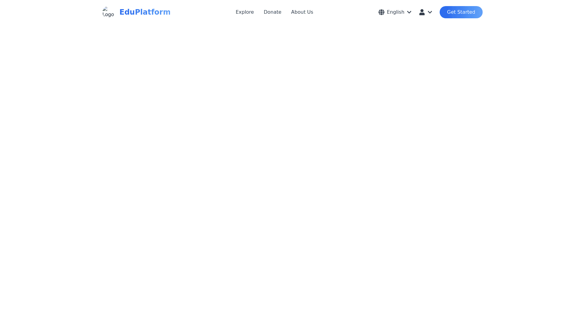
Header - Copy this React, Tailwind Component to your project
Header Design: The header will have a clean and modern design, suitable for an educational platform or similar application, with key attributes and aesthetic effects. Attributes: 1. Logo and Branding: A rounded logo icon on the left with a hover effect (e.g., scaling up slightly and casting a soft shadow when hovered). Beside the logo, display the brand name in a professional font with a smooth fade in effect on page load. 2. Navigation Links: Include menu items like: Explore: For browsing available courses or features. Donate: For donations or support. About Us/Contact: Additional options depending on platform purpose. Profile Dropdown: Clicking on "Profile" reveals options like "View Profile," "Settings," and "Log Out." A dropdown animation with a sliding effect for a polished user experience. 3. Language Selector: Add a language toggle dropdown (e.g., "Tiếng Việt") with a globe icon to indicate language selection. Include an animation where the dropdown slides down smoothly when clicked. 4. Call to Action (Optional): Add a button (e.g., "Sign Up" or "Get Started") on the right side of the header, styled with: Rounded corners. A gradient background with hover effects (e.g., a glowing outline or a slight change in gradient direction). Animations and Effects: Hover Effects: Menu items subtly change color (e.g., light blue to dark blue) or grow slightly larger when hovered over. Add an underline animation for links that slides in from left to right on hover. Dropdown Menu Animation: The dropdown menu (e.g., "Profile" options) slides down smoothly with a slight fade in effect. When closed, it slides up and fades out for a seamless transition. Sticky Header: Make the header sticky, so it remains at the top when scrolling down the page. Add a shrinking effect: as the user scrolls, the header height decreases slightly for a more compact look. Interactive Logo: The logo rotates gently or zooms in slightly when clicked, creating a fun, interactive feel. Styling: Background: Semi transparent with a slight blur effect (using CSS backdrop filter) to give it a modern, glass like look. Colors: Use a light color palette with blue and white accents, complemented by soft gradients. Font: Use a clean sans serif font (e.g., Google Fonts like Roboto or Poppins).
