Styled App Bar - Copy this React, Mui Component to your project
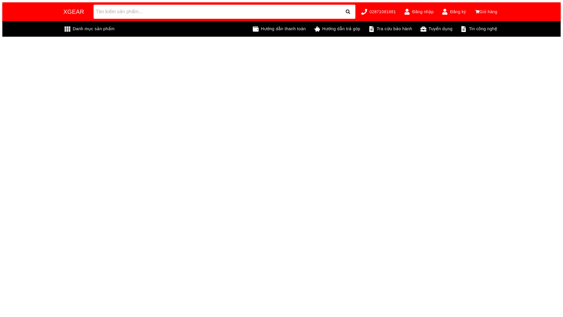
Header Layout: Logo and Branding: The "XGEAR" logo should remain on the left side, just like in image 2, with the same size and padding to maintain its prominence. Search Bar: The search bar should be positioned next to the logo, spanning a large portion of the header width. The placeholder text should be clearly visible, and the search icon should be aligned to the right, ensuring ease of use. The input field should be long enough to accommodate typical search queries. Hotline and Customer Support: The hotline number and phone icon should be displayed next to the search bar on the right side. Ensure that it is easily readable and uses a similar font size as in image 2. Login/Register and Cart: The "Đăng nhập" (Login), "Đăng ký" (Register), and the cart icon (Giỏ hàng) with the item count should be placed on the far right of the header. These elements should be aligned neatly in one row, as shown in image 2. Sub-Header Layout: Product Categories (Danh mục sản phẩm): A dropdown menu with the "Danh mục sản phẩm" (Product categories) label and grid icon should be aligned on the left side of the sub-header, as it is in image 2. This menu should be prominent and clickable. Quick Links: Icons and labels for: Hướng dẫn thanh toán (Payment Guide) Hướng dẫn trả góp (Installment Guide) Tra cứu bảo hành (Warranty Lookup) Tuyển dụng (Careers) Tin công nghệ (Technology News) These should all be displayed in a single row, with enough spacing between them to be easily clickable. Their alignment and size should match those shown in image 2. Color Scheme and Spacing: Maintain the red and black color scheme seen in image 2. The red background should be used for the header, while the sub-header should use a black background with white icons and text for clarity. Ensure the padding and margins between elements are consistent with image 2, giving the layout a clean and organized appearance. Typography and Icon Size: The font size and icon size should be consistent with those in image 2 to ensure readability and accessibility on tablet screens. Ensure that the icons have sufficient spacing around them so that they are easy to tap on touchscreen devices.