Dashboard Layout Component - Copy this Html, Bootstrap Component to your project
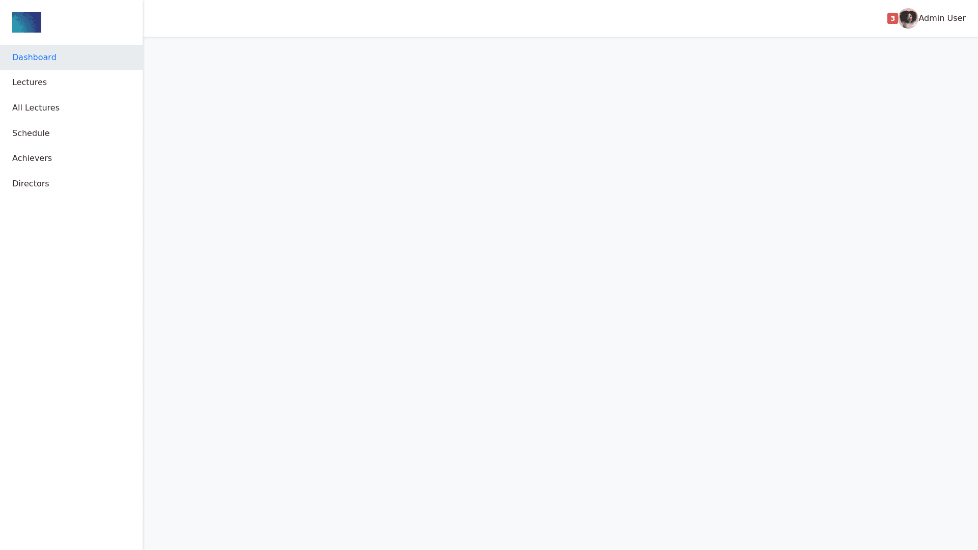
Header-Section-(<!--Header-start-->)-Header-Wrapper-(<div-class="header">):-This-wraps-the-header-content-at-the-top-of-the-page.-Left-Side-of-the-Header-(<div-class="header-left">):-Menu-Icon-(<div-class="menu-icon-bi-bi-list"></div>):-This-icon-represents-a-sidebar-toggle-for-mobile-or-smaller-screens.-Search-Icon-(<div-class="search-toggle-icon-bi-bi-search">):-Clicking-this-toggles-the-search-input-field.-Search-Form-(<div-class="header-search">):-Contains-an-input-field-to-search-within-the-dashboard.-Right-Side-of-the-Header-(<div-class="header-right">):-Notifications-(<div-class="user-notification">):-A-dropdown-that-displays-a-notification-bell-icon-with-a-badge-to-show-new-notifications.-Notification-List-(<div-class="dropdown-menu">):-Contains-a-list-of-notifications-with-the-name,-message,-and-an-avatar.-User-Information-(<div-class="user-info-dropdown">):-Displays-the-logged-in-user’s-profile-picture-and-name-with-a-dropdown-for-options-like-profile,-settings,-and-logout.-Left-Sidebar-(<!--left-sidebar-start-->)-Brand-Logo-(<div-class="brand-logo">):-Contains-a-logo-and-a-close-button-to-toggle-the-sidebar.-Menu-(<div-class="sidebar-menu">):-Uses-a-list-structure-to-display-navigation-links.-Menu-Items-(<li>):-Each-item-is-structured-as-a-dropdown,-with-icons-and-links-to-specific-sections-of-the-dashboard,-such-as-"Home,"-"Lectures,"-"Achievers,"-"Directors,"-etc.-Dropdowns-for-Subsections-(<ul-class="submenu">):-Some-items,-like-"Lectures"-and-"Directors,"-contain-submenus-that-expand-to-show-additional-links,-allowing-the-user-to-navigate-to-more-detailed-pages.-This-setup-provides-a-clear-and-organized-layout-for-a-dashboard,-with-a-header-containing-user-and-notification-details-and-a-sidebar-for-easy-navigation-between-sections-of-the-dashboard.-The-code-uses-Bootstrap-Icons-(bi-classes)-for-visual-elements,-making-it-visually-consistent-and-functional-for-an-admin-panel.