Header - Copy this React, Tailwind Component to your project
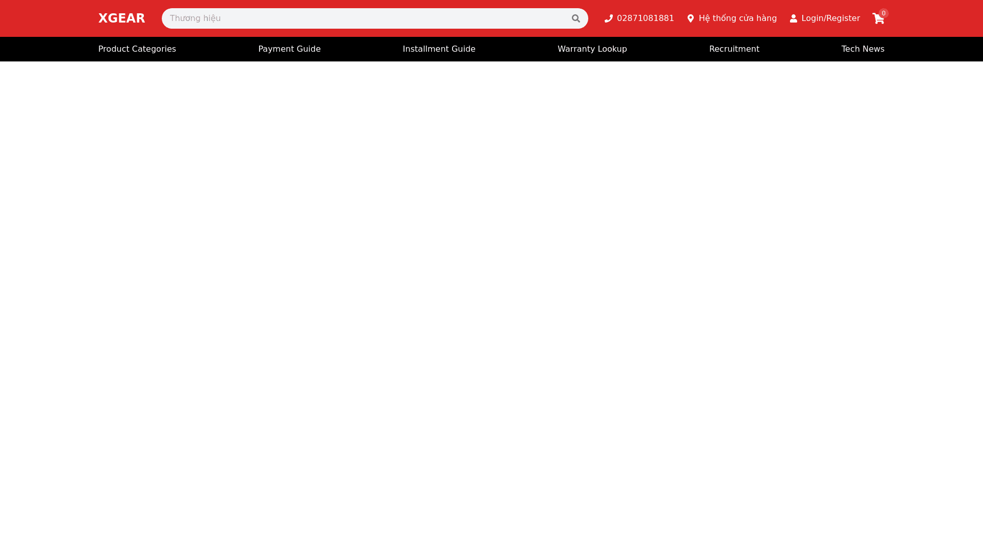
Header Section Design Specification: Header Background: The topmost header section has a solid red background (#D91E1E or similar shade) that spans the full width of the page. Logo Placement: The logo “XGEAR” is placed on the left hand side. The logo should be aligned vertically in the center and have sufficient padding around it for clarity. Search Bar: The search bar is centrally aligned, with a light grey input field placeholder text “Thương hiệu” (brand). The search icon (a magnifying glass) is located on the right side of the input field and should be clickable. Contact and Shop Information: To the right of the search bar: Hotline: Display the hotline number 02871081881 with a clickable phone icon next to it. Store Locator: The text “Hệ thống cửa hàng” (Store system) with an icon resembling a store location pin next to it. When hovered, a dropdown menu shows additional store locations or details. Login/Register Section: A Login/Register button is on the right side, with a person icon. This section should provide a dropdown for both login and register options when hovered. Shopping Cart: The shopping cart icon is positioned on the far right. It shows the current number of items in the cart (displayed as 0 by default in red). The shopping cart is clickable and redirects to the cart page. Secondary Navigation Bar: Background and Layout: The secondary bar beneath the header has a black background and spans the full width. The items are horizontally aligned and equally spaced across the section. Icons and Links: Each item has an icon followed by descriptive text. These items are clickable links that redirect to their respective pages: Product Categories (Danh mục sản phẩm): A grid icon followed by the text "Danh mục sản phẩm." Payment Guide (Hướng dẫn thanh toán): An icon of currency with the text “Hướng dẫn thanh toán.” Installment Guide (Hướng dẫn trả góp): Piggy bank icon with the text “Hướng dẫn trả góp.” Warranty Lookup (Tra cứu bảo hành): A paper document icon with the text “Tra cứu bảo hành.” Recruitment (Tuyển dụng): A magnifying glass icon followed by the text “Tuyển dụng.” Tech News (Tin công nghệ): Document icon followed by the text “Tin công nghệ.” Key CSS Suggestions: Main Colors: Red (#D91E1E) for the header background and cart count. Black (#000000) for the secondary navigation bar. White (#FFFFFF) for text/icons on the red background. Font Styles: Use a modern sans serif font for all text. Headings such as "Danh mục sản phẩm" or "Hướng dẫn thanh toán" can be in bold, while other text can have a normal weight. Spacing and Padding: Ensure adequate padding and margin for elements, especially the search bar and the icons in the secondary bar. Keep the elements horizontally centered with proper spacing between icons and text. Hover Effects: On hover, change the background of the buttons/links to a lighter shade or apply an underline effect.