Portfolio App - Copy this React, Tailwind Component to your project
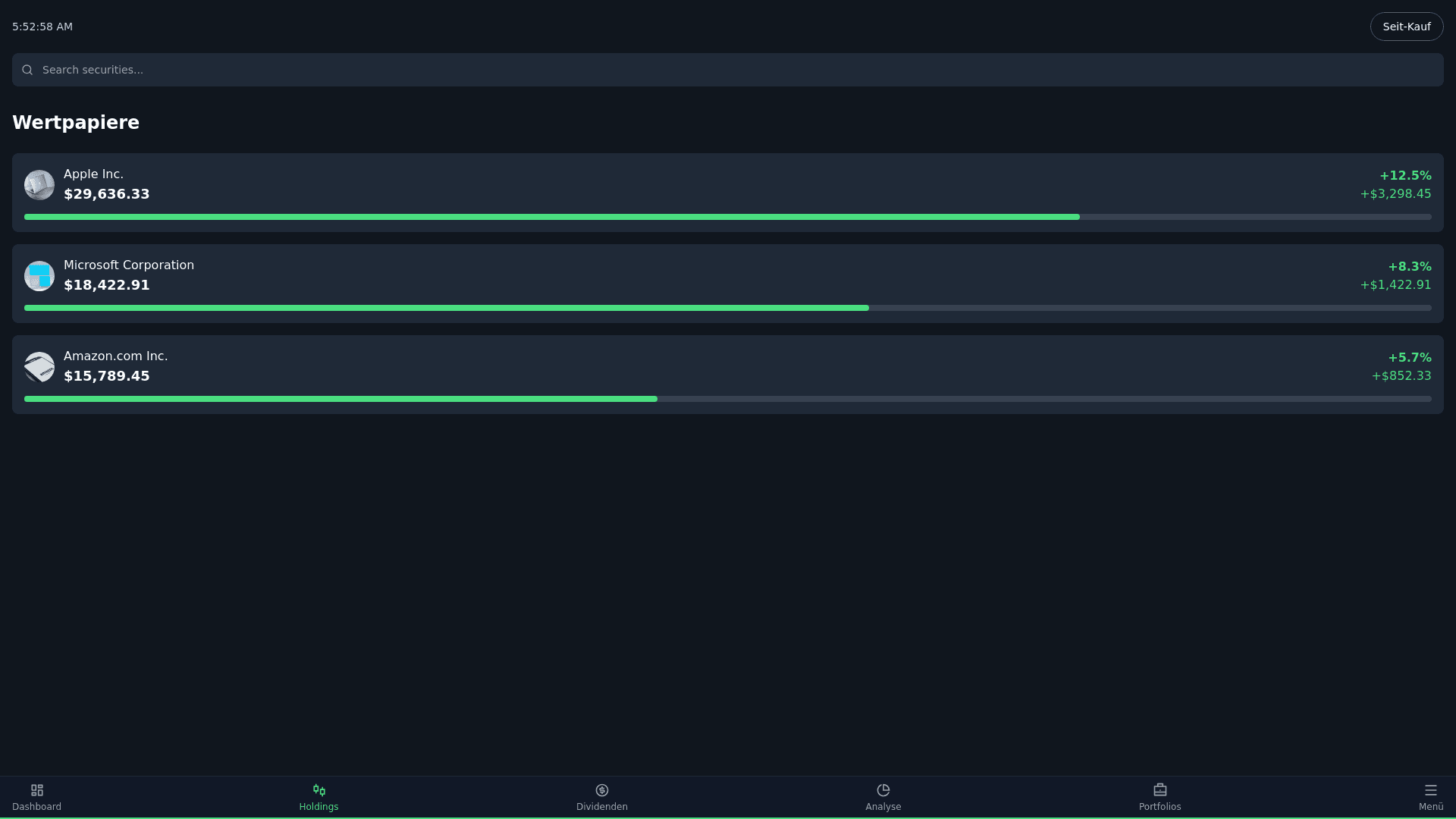
Here’s a breakdown of the components of the screenshot: General Layout • Background: The screen uses a dark theme with a navy blue or near black background, ensuring contrast with the text and icons. • Sections: • A header at the top with a search bar and a filter button (“Seit Kauf”). • A main content area displaying a list of securities (“Wertpapiere”). • A bottom navigation bar with icons for “Dashboard,” “Holdings,” “Dividenden,” “Analyse,” “Portfolios,” and “Menü.” Typography 1. Header: • Font: Sans serif, bold for emphasis. • Size: Large for the main title (“Holdings”). • Color: White or light gray. 2. List Items: • Primary Text (Company Name): Medium or bold sans serif font, white text. • Secondary Text (Monetary Value): Larger font, white or light gray for the dollar amount. • Gain Information: • Bold sans serif for percentage and dollar values. • Gain percentages are in green to denote positive growth. Colors 1. Background: Dark navy or near black (#10161E). 2. Text: • Primary (e.g., company names): White (#FFFFFF). • Secondary (e.g., monetary values): Light gray (#B0BEC5). 3. Positive Gains: Green (#4CAF50 or similar). 4. Icons: • Bright, recognizable colors that align with branding (e.g., red for ExxonMobil, blue for Lowe’s). • Flat, modern icon design. Components 1. Header Section: • Time Indicator: Top left, subtle white font. • Filter Dropdown (“Seit Kauf”): Rounded button with a light gray border or background. 2. Search Bar: • Simple magnifying glass icon in white. 3. List Items: • Icon: Circular icons on the left for each company. • Primary Information: Company name and total holding value (aligned horizontally). • Progress Bar: Below each list item, a subtle line in blue or green indicating holding proportion. • Gain Indicators: On the right side, positive values in green with arrows for percentage growth. 4. Navigation Bar: • Icons: Flat, modern icons labeled with text beneath each (e.g., Dashboard, Holdings, etc.). • Highlight: “Holdings” is selected, likely indicated with a green underline or bold text. Hierarchy and Spacing • Spacing: Generous padding between sections and list items. • Alignment: • Left aligned text for readability. • Right aligned values (gains, percentages) for emphasis. • Typography Size: • Larger fonts for primary data (e.g., $29,636.33). • Smaller fonts for labels and details. This description provides a detailed reference for generating code to replicate this UI. Let me know if you’d like the exact CSS or layout framework suggestions!