Styled Card - Copy this React, Mui Component to your project
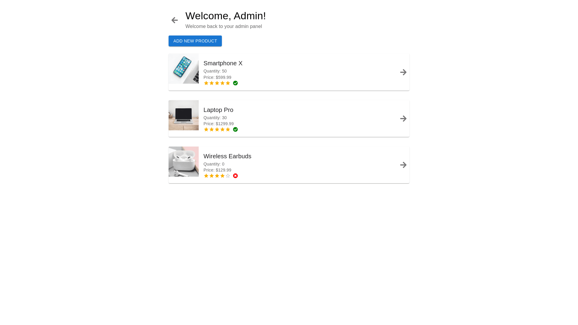
Import React from 'react'; import { View, Text, FlatList, TouchableOpacity, StyleSheet, Image, Pressable } from 'react native'; import Icon from 'react native vector icons/FontAwesome'; const HomeAdminScreen = ({ navigation }) => { const products = [ { id: '1', name: '#HWDSF776567DS', price: '1.500.000', quantity: 500, rating: '4.0', review: '860', sale: 80, category: 1, image: { uri: 'https://hoanghamobile.com/tin tuc/wp content/webp express/webp images/uploads/2023/08/anh phat dep lam hinh nen 62.jpg.webp' }, }, { id: '2', name: '#Ha5s1d56sa7DS', price: '1.000.000', quantity: 500, rating: '3.0', review: '860', sale: 0, category: 2, image: { uri: 'https://hoanghamobile.com/tin tuc/wp content/webp express/webp images/uploads/2023/08/anh phat dep lam hinh nen 62.jpg.webp' }, }, { id: '3', name: '#HADSAF776567DS', price: '500.000', quantity: 500, rating: '3.0', review: '860', sale: 50, category: 3, image: { uri: 'https://hoanghamobile.com/tin tuc/wp content/webp express/webp images/uploads/2023/08/anh phat dep lam hinh nen 62.jpg.webp' }, }, ]; const renderProduct = ({ item }) => ( <TouchableOpacity style={styles.productItem} onPress={() => navigation.navigate('DetailScreen', { image: item.image, name: item.name, price: item.price, rating: item.rating, quantity: item.quantity, sale: item.sale, })} > <View style={{ marginRight: 20, }}> <Image source={item.image} style={styles.productIcon} /> </View> <View style={styles.productDetails}> <Text style={styles.productCode}>{item.name}</Text> <Text style={styles.productStatus}>Số Lượng Tồn: {item.quantity}</Text> <View style={styles.line}></View> <Text style={styles.productCode}>Giá: {item.price} ₫</Text> </View> <Pressable> <Icon name="angle right" size={25} color="#000" /> </Pressable> </TouchableOpacity> ); return ( <View style={styles.container}> {/* Header */} <View style={styles.header}> <View style={styles.welcomeContainer}> <Text style={styles.welcomeText}>Hi Admin!</Text> <Text style={styles.subtitleText}>Welcome back to your panel.</Text> </View> <TouchableOpacity onPress={() => navigation.navigate('LoginScreen')} > <Image source={require('../../../assets/right_from_bracket.png')} style={{ width: 30, height: 30, marginLeft: 115 }} /> </TouchableOpacity> </View> {/* Product List */} <FlatList data={products} renderItem={renderProduct} keyExtractor={(item) => item.id} style={styles.productList} /> {/* Add Button */} <TouchableOpacity style={styles.addButton} onPress={() => navigation.navigate('AddProductScreen')}> <Text style={styles.addButtonText}>+</Text> </TouchableOpacity> </View> ); }; const styles = StyleSheet.create({ container: { flex: 1, padding: 20, backgroundColor: '#fff', }, header: { flexDirection: 'row', alignItems: 'center', marginBottom: 30, }, line: { width: '95%', height: 1, backgroundColor: '#ededed', marginVertical: 10, }, menuButton: { marginRight: 10, }, menuIcon: { width: 35, height: 35, borderColor: '#ededed', borderRadius: 24, borderWidth: 2, marginTop: 0, }, welcomeText: { fontSize: 24, fontWeight: 'bold', }, subtitleText: { fontSize: 16, color: '#666', }, productListTitle: { position: 'absolute', fontSize: 24, fontWeight: 'bold', marginBottom: 10, left: '35%' }, productList: { flex: 1, }, productItem: { flexDirection: 'row', alignItems: 'center', borderColor: '#ededed', borderWidth: 2, padding: 20, borderRadius: 10, marginBottom: 10, }, productIcon: { width: 55, height: 55, marginLeft: 5, marginTop: 5, }, productDetails: { flex: 1, }, productCode: { fontSize: 16, fontWeight: 'bold', }, productStatus: { fontSize: 14, color: '#888', }, arrowIcon: { width: 20, height: 20, }, addButton: { position: 'absolute', bottom: 30, right: 30, width: 60, height: 60, borderRadius: 30, backgroundColor: '#3669c9', justifyContent: 'center', alignItems: 'center', }, addButtonText: { fontSize: 40, color: '#fff', }, }); export default HomeAdminScreen;