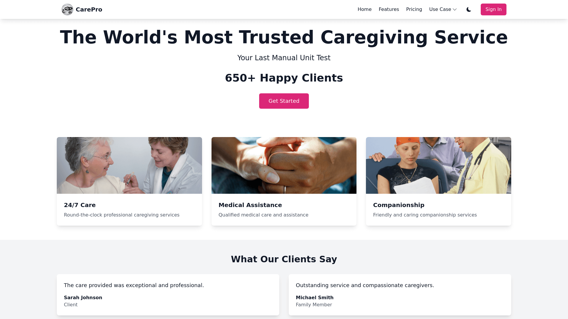
Home Page - Copy this React, Tailwind Component to your project
Design-a-homepage-for-care-giver-comapny-that-provides-xhild-care,-cooker,cleaner,home-tutor-,-elderly-care-gig-workers-for-clients-use-gsap-and-three.js-for-better-animation-that-gives-modern-and-beautiful-looks-and-use-these-as-main-color-#CE257A-and-have-light-and-dark-modehere-is-the-rule-u-must-follow-1.-Navbar:---Position:-The-navbar-is-typically-placed-at-the-top-of-the-page,-spanning-the-full-width-of-the-screen.---Alignment:---Left-Side:-Contains-the-company-logo-or-brand-name,-aligned-to-the-left.---Right-Side:-Includes-navigation-links-(e.g.,-"Home,"-"Features,"-"Pricing,"-"Use-Case,"-"Company")-,switch-for-light-and-dark-mode,-sign-in-user-profile-section-that-displays-a-dropdown-menu-with-options-like-My-Profile,-Request-Specific-Service,-List-of-Requested-Services,-My-Appointments,-and-Logout-if-the-user-is-logged-in-(determined-by-the-token-and-userData-from-AppContext);-if-not-logged-in,-a-Create-Account-button-redirects-to-the-login-page.-These-are-aligned-to-the-right.---Icons:-Icons-like-user-profile,-search,-or-menu-(for-mobile)-are-placed-on-the-far-right.-If-the-user-is-logged-in,-a-dropdown-menu-might-appear-when-clicking-the-profile-icon.---Dropdown-Menus:-Items-like-"Use-Case"-and-"Company"-may-have-dropdown-menus-that-appear-on-hover-or-click,-revealing-additional-options.-and-some-----2.-Header:---Position:-The-header-is-placed-just-below-the-navbar,-often-centered-or-aligned-to-the-left.---Content:-It-includes-a-bold,-attention-grabbing-title-like-"The-World's-Most-Accurate-Unit-Testing-Generative-AI".---Typography:-The-text-is-large,-clean,-and-modern,-often-with-a-bold-font-to-emphasize-the-headline.---Alignment:-The-header-text-is-centered-horizontally,-with-ample-white-space-around-it-to-make-it-stand-out.-----3.-Hero-Section:---Position:-The-hero-section-is-placed-below-the-header,-taking-up-a-significant-portion-of-the-screen.---Content:---Main-Text:-A-subheading-like-"Your-Last-Manual-Unit-Test"-is-placed-below-the-header,-often-in-a-smaller-font-size-but-still-prominent.---Dynamic-Counter:-A-large,-animated-counter-(e.g.,-"4,587,144+-Unit-tests-written-by-Community-Edison")-is-placed-below-the-subheading.-The-counter-starts-from-0-and-counts-up-dynamically.---Call-to-Action-(CTA):-A-button-or-link-(e.g.,-"Get-Started"-or-"Learn-More")-might-be-placed-below-the-counter,-centered-or-aligned-to-the-left.---Alignment:-The-content-in-the-hero-section-is-typically-centered-both-horizontally-and-vertically,-creating-a-balanced-and-visually-appealing-layout.---Background:-The-hero-section-may-have-a-subtle-background-image,-gradient,-or-animation-to-make-it-more-engaging.-Partners-Logos-Animation:-Hover-Effect:-Implement-a-horizontal-scrolling-animation-for-the-company-logos.-When-the-user-hovers-over-the-logo-section,-the-logos-should-move-from-right-to-left-smoothly.-Use-CSS-transitions-and-JavaScript-to-handle-the-hover-effect-and-animation.-On-hover,-the-logos-should-change-from-grayscale-to-full-color-to-make-them-visually-appealing.-----Card-DesDynamic-Unit-Test-Counter:-Counting-Animation:-Implement-a-dynamic-counter-for-the-unit-tests-that-starts-from-0-and-counts-up-to-the-final-number-(e.g.,-4,587,144).-Use-JavaScript-to-create-the-counting-animation,-ensuring-it’s-smooth-and-visually-engaging.-You-can-use-libraries-like-CountUp.js-for-this-effect.ign-and-Motion:-Dropdown-Motion:-Design-the-cards-with-a-dropdown-motion-effect.-When-the-user-scrolls-to-the-card-section,-each-card-should-animate-into-view-from-the-top.-Use-CSS-keyframes-or-JavaScript-libraries-like-GSAP-for-smooth-animations.-Ensure-the-cards-have-a-clean,-modern-design-with-subtle-shadows-and-rounded-corners.-4.-Icons-and-Interactive-Elements-for-testmonial-section:---Dynamic-Counter-Icons:-If-there-are-icons-associated-with-the-unit-test-counter-(e.g.,-a-test-tube-or-checkmark),-they-are-placed-next-to-or-above-the-counter-to-visually-reinforce-the-message.---Arrow-Buttons:-Up-and-down-arrow-buttons-for-navigating-through-test-options-are-placed-near-the-counter-or-hero-section,-often-on-the-right-or-left-side.---Hover-Effects:-Icons-and-buttons-have-hover-effects-(e.g.,-color-change,-scaling)-to-make-them-interactive-and-engaging.-----5.-Footer:---Position:-The-footer-is-placed-at-the-bottom-of-the-page,-spanning-the-full-width.---Content:---Links:-Includes-links-to-important-pages-like-"About-Us,"-"Contact,"-"Privacy-Policy,"-and-"Terms-of-Service."---Social-Media-Icons:-Icons-for-social-media-platforms-(e.g.,-Twitter,-LinkedIn,-GitHub)-are-placed-on-the-right-or-center-of-the-footer.---Copyright-Notice:-A-copyright-statement-(e.g.,-"©-2023-Community-Edison")-is-placed-at-the-bottom,-often-centered.---Alignment:-Footer-content-is-typically-aligned-in-columns,-with-links-on-the-left,-social-media-icons-in-the-middle,-and-legal-information-on-the-right.-----6.-Responsive-Design:---Navbar:-On-mobile-devices,-the-navbar-collapses-into-a-hamburger-menu,-with-navigation-links-hidden-until-clicked.---Hero-Section:-The-text-and-counter-in-the-hero-section-are-resized-and-stacked-vertically-for-smaller-screens.---Footer:-Footer-content-is-stacked-vertically-on-mobile-devices-to-ensure-readability.-----Summary-of-Alignment-and-Placement:---Navbar:-Logo-on-the-left,-links-and-icons-on-the-right.---Header:-Centered,-large-bold-text.---Hero-Section:-Centered,-with-dynamic-counter-and-CTA.---Icons:-Placed-near-interactive-elements-(e.g.,-counter,-arrows).---Footer:-Links-on-the-left,-social-icons-in-the-middle,-legal-info-on-the-right.
