Responsive Component - Copy this React, Tailwind Component to your project
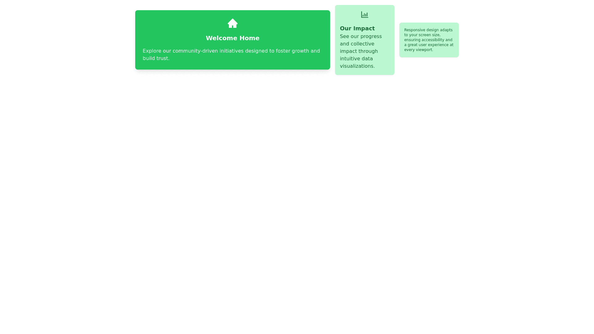
Design a "Home Screen" for a mobile app that connects users to: Utilize Assets: Transportation, financial products, real estate. Hone Skills: Project based NGOs affiliated with BEAM (a non profit think tank that uses data from affiliated NGOs to suggest policy and provide scholarships). Key Considerations for the Design User Centric Focus: Provide a clear overview of user progress, available assets, and personalized recommendations. Brand Identity: Reflect the platform's mission of connection, growth, and community impact. Data Visualization: Use intuitive charts and graphs to represent user progress and asset usage. Accessibility: Ensure the design is inclusive for users with disabilities. Engagement: Encourage user interaction with clear call to action elements and engaging visuals. Detailed Design Specifications Home Screen Layout: Header: Display the platform's logo and a welcome message with the user's name. Main Section: User Progress: Progress bar or circular progress indicator showing the user's overall progress. Breakdown of progress in different areas (e.g., skills development, asset utilization). Available Assets: Icons or images representing different assets (transportation, financial products, real estate). Brief descriptions and current status (e.g., availability, usage statistics). Recommendations: Personalized recommendations based on user data (e.g., suggested projects, new assets to explore). Highlighted scholarship opportunities from BEAM. Footer: Navigation bar with icons for Home, Explore, Messages, and Profile. Design Elements: Colors: Use a color scheme that reflects trust, growth, and community (e.g., shades of blue, green, and neutral tones). Typography: Clear and readable fonts with a focus on accessibility. Icons and Images: Use intuitive icons and images that represent the different assets and progress areas. Data Visualization: Incorporate charts and graphs to visually represent user progress and asset usage. Interactive Elements: Progress Indicators: Use interactive progress bars or circular indicators that users can click to see detailed breakdowns. Asset Cards: Clickable cards for each asset that lead to detailed information and actions users can take. Recommendations Section: Swipeable cards or a scrolling list of recommendations tailored to the user. Accessibility Features: Ensure high contrast for text and background. Support for screen readers. Large touch targets for interactive elements. Example Layout Header: Logo | Welcome Message: "Welcome, [User Name]" Main Section: User Progress: Progress Indicator: [Progress Bar/Circular Indicator] Detailed Breakdown: Skills Development | Asset Utilization Available Assets: Asset Cards: Transportation | Finance | Real Estate Status Indicators: Availability | Usage Statistics Recommendations: Suggested Projects: [Project Cards] Scholarship Opportunities: [Scholarship Cards] Footer: Navigation Bar: [Home] [Explore] [Messages] [Profile] Additional Notes Ensure the design reflects the platform's mission and values. Prioritize the user experience by making navigation straightforward and intuitive. Use engaging visuals to keep users informed and motiv