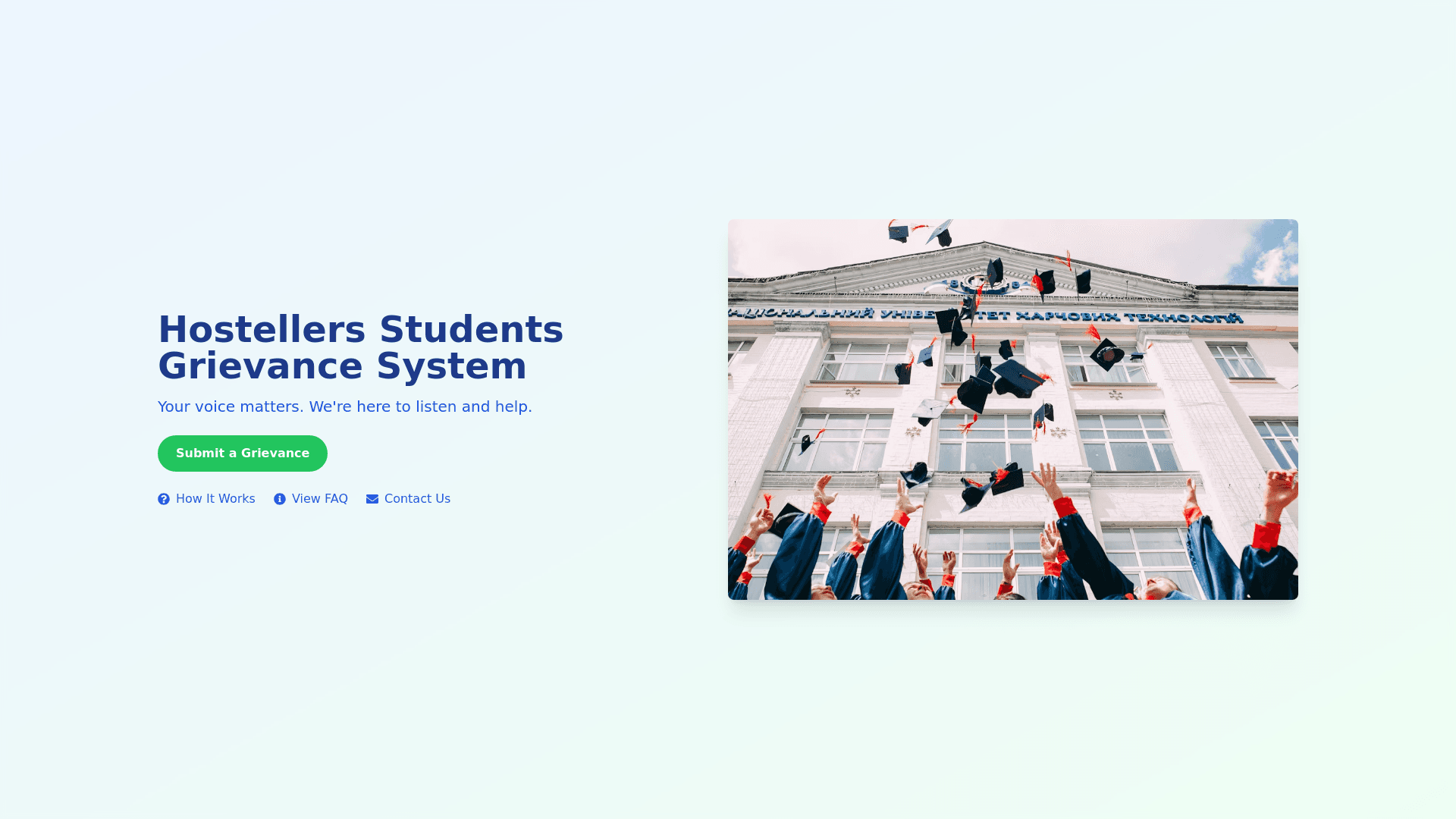
Hero Section - Copy this React, Tailwind Component to your project
For the Hostellers Students Grievance System hero section, you want to create a welcoming, informative, and user friendly UI that conveys the purpose of the platform: a system for students to submit grievances efficiently. Below is a detailed prompt for designing the hero section UI. Prompt for Hero Section Design: Background: Design a clean and modern hero section with a calming, academic vibe. Use a background image or gradient that reflects university life or hosteller living (e.g., a soft, abstract representation of dormitories or student community life). The colors should be professional, approachable, and convey trust, such as shades of blue, green, or pastel tones. Main Headline: A bold, concise statement to introduce the purpose of the platform. The headline should be eye catching and centered on the page. Text: “Resolve Your Grievances Seamlessly with Hostellers Students Grievance System.” Font: Use a large, readable sans serif font that stands out but is not overwhelming. Consider something modern like Poppins or Lato. Color: The text should contrast with the background, such as white or dark blue depending on the background color. Subheadline: A short, informative line that explains what the system does. Text: “An easy and secure way to submit, track, and resolve all your hostel related issues.” Font: Slightly smaller than the main headline, but still readable at a glance. Call to Action (CTA) Button: A prominent button that encourages students to take action, such as "Submit Your Complaint Now." Color: Use a vibrant color that stands out (e.g., a bright blue or green) with clear white text. Shape: Rounded edges for a friendly, approachable feel. Hover Effect: A subtle animation like a color change or shadow effect when hovered over. Illustration or Graphic: Include an illustration or icon that visually represents the grievance system. It could be a symbolic image of students interacting with the system, a laptop, or a mobile device displaying a complaint submission interface. Placement: Either on the right side of the text or as a background visual behind the text. Style: Use modern flat or minimalistic design to keep it simple yet appealing. Quick Links: Below the CTA button, add small quick links to important sections like: “How It Works,” “View FAQ,” and “Contact Us” in a smaller font size. Use simple icons next to these links for visual clarity. Responsive Design: Ensure the design is fully responsive. On mobile, stack the text, CTA, and image vertically, centering all elements for ease of readability. Style Guide: Colors: Professional, calm tones (e.g., navy blue, soft greens, pastel). Fonts: Modern sans serif, easily readable and clean. Spacing: Ample whitespace between elements to keep the design uncluttered.
