Data - Copy this React, Tailwind Component to your project
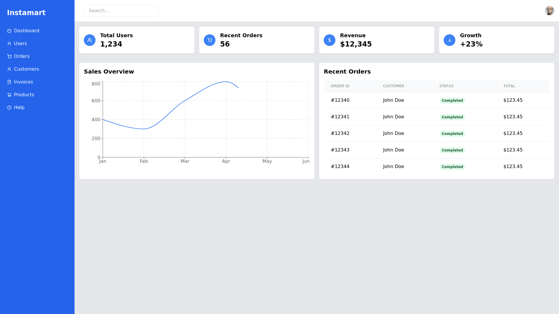
Create an image of a modern, fully responsive admin panel dashboard that adapts seamlessly across desktop, tablet, and mobile devices. The design should feature a clean, professional look with a sidebar for navigation on larger screens, showcasing a bold "Instamart" logo at the top in big, bold, sans serif fonts. On mobile and tablet views, the sidebar should collapse into a hamburger menu in the top left corner, which when clicked, slides the sidebar in from the left. Inside the sidebar, include navigation links like "Dashboard," "Users," "Orders," "Customers," "Invoices," "Products," and "Help," each accompanied by sleek, minimalistic icons for quick identification. Add a visible cross (X) button at the top right for closing the sidebar. The header section should include a user avatar image on the right; when clicked, it should open a dropdown menu with options like "Edit User," "Change Password," "Update Profile," and "Logout." The header should also include a search bar for quick access to information. The main content area should display essential metrics in a card based layout for mobile, such as total users, recent orders, and simple charts, with each card containing an icon representing the metric (e.g., users, orders, etc.). On larger screens, the dashboard should display more detailed charts, tables, and notifications. Ensure the table is fully responsive, adjusting its layout for smaller screens while maintaining readability. Incorporate smooth animations for opening/closing the sidebar, hovering over elements, and transitions between different sections. The icons for each sidebar element (like "Dashboard," "Orders," "Products") should have a uniform, modern style to maintain consistency. The color scheme should use sleek shades of blue, white, and gray to keep a consistent corporate feel, with a user friendly interface across all devices.
