Introduction Section - Copy this React, Tailwind Component to your project
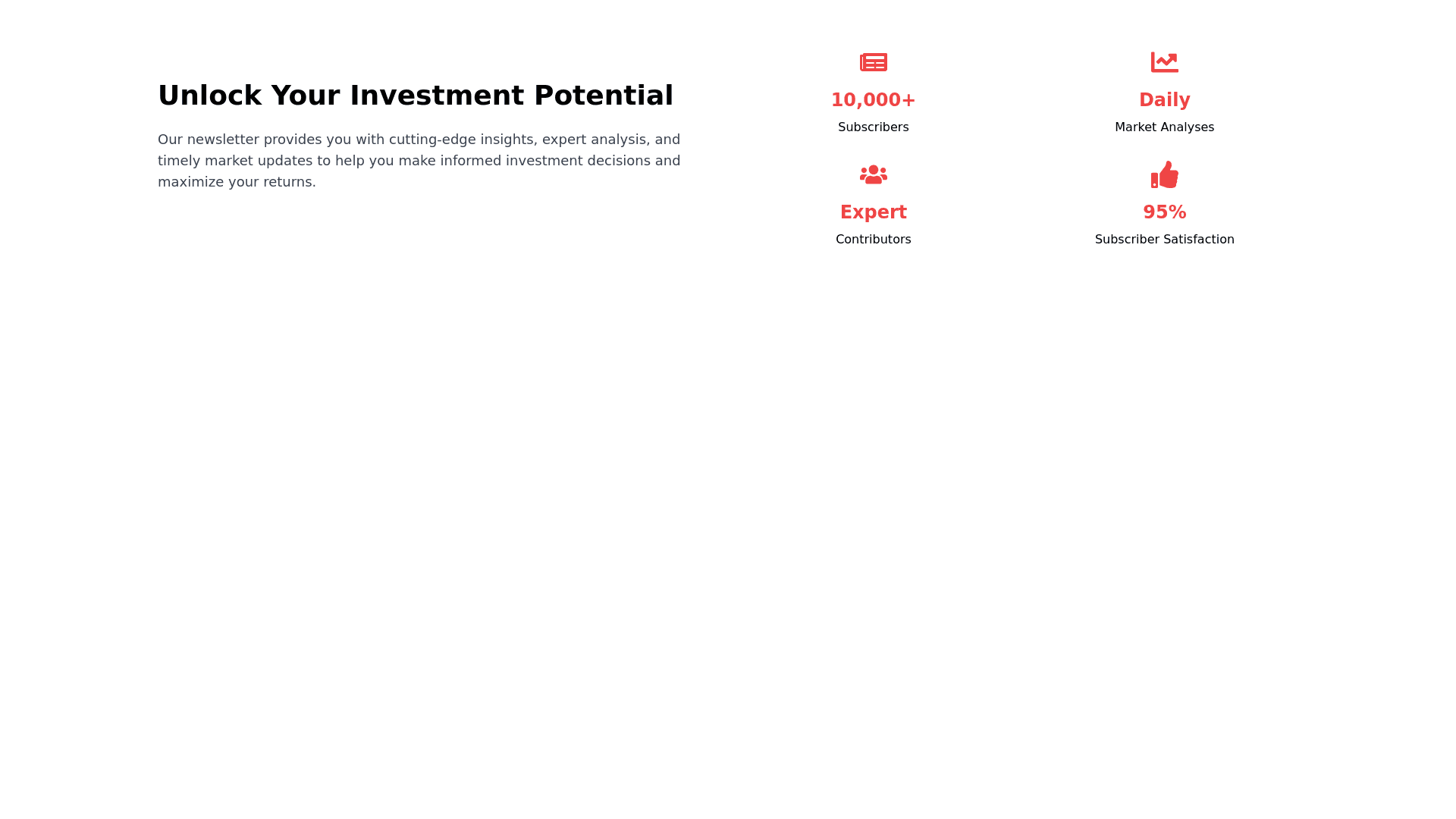
3. Introduction/Features Section Component Description: A two column layout beneath the hero section. Left Column: Large, bold heading like "Unlock Your Investment Potential." Paragraph text introducing the newsletter's value proposition. Right Column: Grid layout displaying key statistics or achievements. Four grid items using object mapping for efficient rendering. Design Details: Left Column: Text Alignment: Left aligned. Text Color: Navy Blue or Black on a white background. Right Column: Statistics Grid: Displays items such as: "10,000+"<br>Subscribers "Daily"<br>Market Analyses "Expert"<br>Contributors "95%"<br>Subscriber Satisfaction Emphasis: Bold numbers or titles in red for emphasis. Descriptions: In navy blue or black text. Spacing: Ample whitespace for an uncluttered look. Technical Implementation: Uses React with flexbox or grid for layout: grid, grid cols 2, gap 8 Object Mapping: Maps over an array of statistics to render grid items. Tailwind CSS for styling and responsiveness.