Styled Table Cell - Copy this React, Mui Component to your project
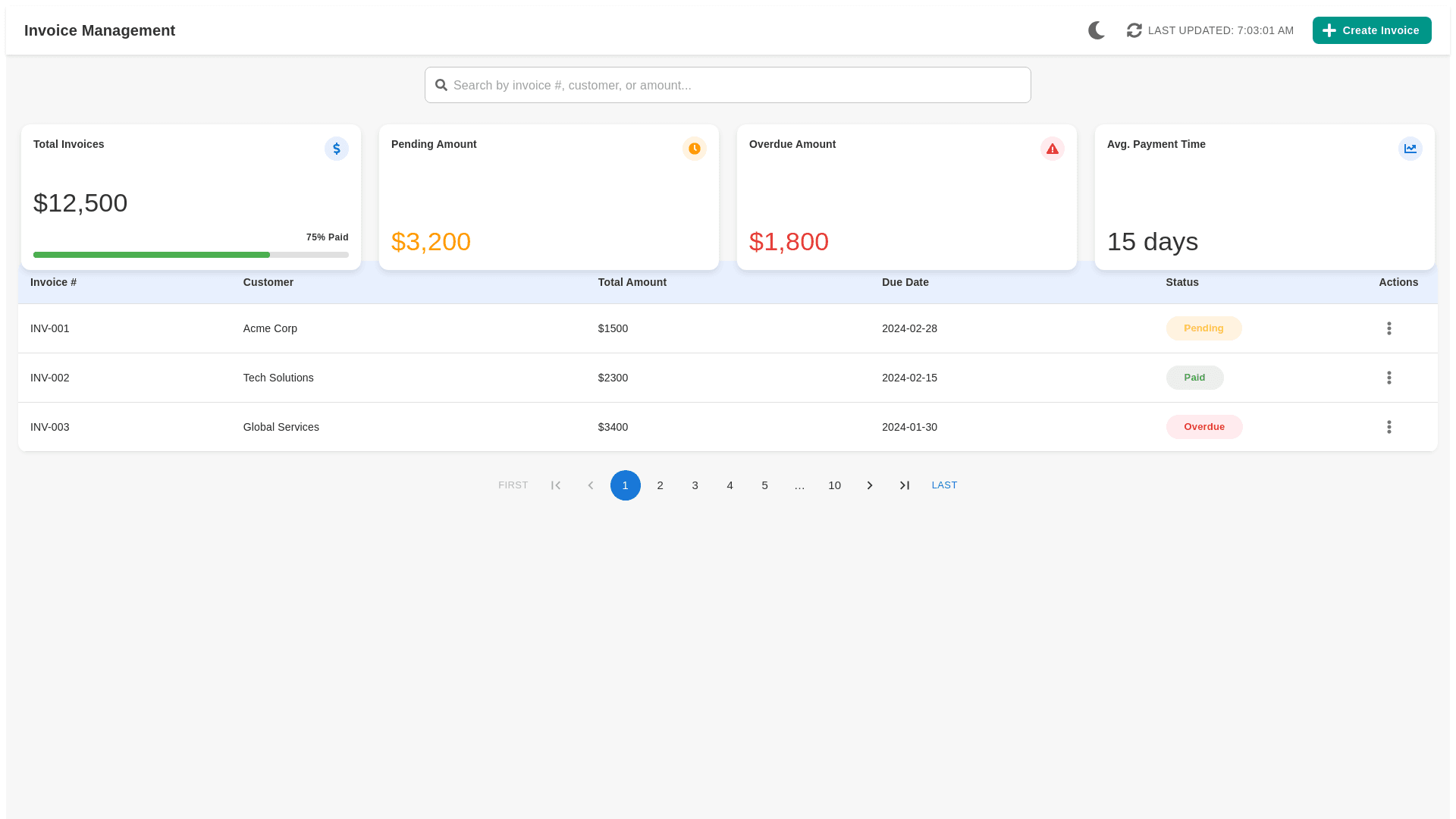
o enhance the Invoice Management dashboard from the image you provided, particularly focusing on improving the color scheme to ensure it's both visually appealing and functional, here are some suggestions: Enhanced Color Scheme for Invoice Management Dashboard 1. Background and Layout Colors: Main Background: Use a light gray or off-white background (#f7f7f7 or #fcfcfc) to maintain a clean and uncluttered look, which will help the other colors stand out more effectively. Content Background: Panels containing invoices and statistics can use a slightly darker shade of white (e.g., #ffffff) to create a subtle depth effect, making the interface appear layered. 2. Summary Metrics Colors: Total Invoices: Maintain the blue color but opt for a softer shade (#007bff) that’s pleasing to the eye yet still stands out as a primary color. Pending Amount: Use a more vibrant shade of orange (#ff9800) that better captures attention without being too harsh. Overdue Amount: Opt for a deeper red (#e53935) to indicate urgency and importance, ensuring it's noticeable at a quick glance. Progress Bar: For the '75% Paid' indicator, use a greener, more vibrant shade (#4caf50) to symbolize financial health and positive progress. 3. Text and Font Colors: Primary Text: Use a dark gray (#333333) instead of pure black to reduce the harshness on the eyes, especially in well-lit environments or for prolonged use. Secondary Text (Subtitles, Headers): A medium gray (#666666) provides a good contrast with the background while keeping the dashboard aesthetically balanced. 4. Table Colors: Header Row: Use a subtle color like very light blue (#e8f0fe) to differentiate the header from other rows and align it with the overall blue theme. Hover States: Implement a hover state with a light gray (#f5f5f5) to highlight the row over which the cursor is positioned, improving user interaction. 5. Status Indicator Colors: Pending Status: Soften the yellow to a warmer tone (#fdd835) to make it less stark. Paid Status: Enhance the green to be slightly brighter (#4caf50) for a more positive reinforcement. Overdue Status: Use a vivid red (#e53935) to ensure it stands out significantly, signaling urgency. 6. Action Buttons and Icons: Buttons: Style the ‘Create Invoice’ button with a teal background (#009688) to give it a distinct, inviting look. Icons and Ellipsis Menu: Opt for a contrasting color like dark gray (#424242) to ensure visibility against both light and dark elements. 7. Interactivity Feedback: Highlight Selections: When a row or checkbox is selected, highlight it with a very subtle blue (#e3f2fd) to indicate selection without overwhelming the visuals. Visual Examples: Navigation and Footer: These should use consistent coloring with the rest of the dashboard for uniformity. For pagination controls, use neutral colors that are visible yet subtle. By applying these color adjustments, your dashboard will not only improve in terms of aesthetic appeal but will also enhance usability. Clear, distinct colors help in quickly navigating through the dashboard and effectively managing tasks, making the overall user experience more intuitive and efficient.