Jarvis a I - Copy this React, Tailwind Component to your project
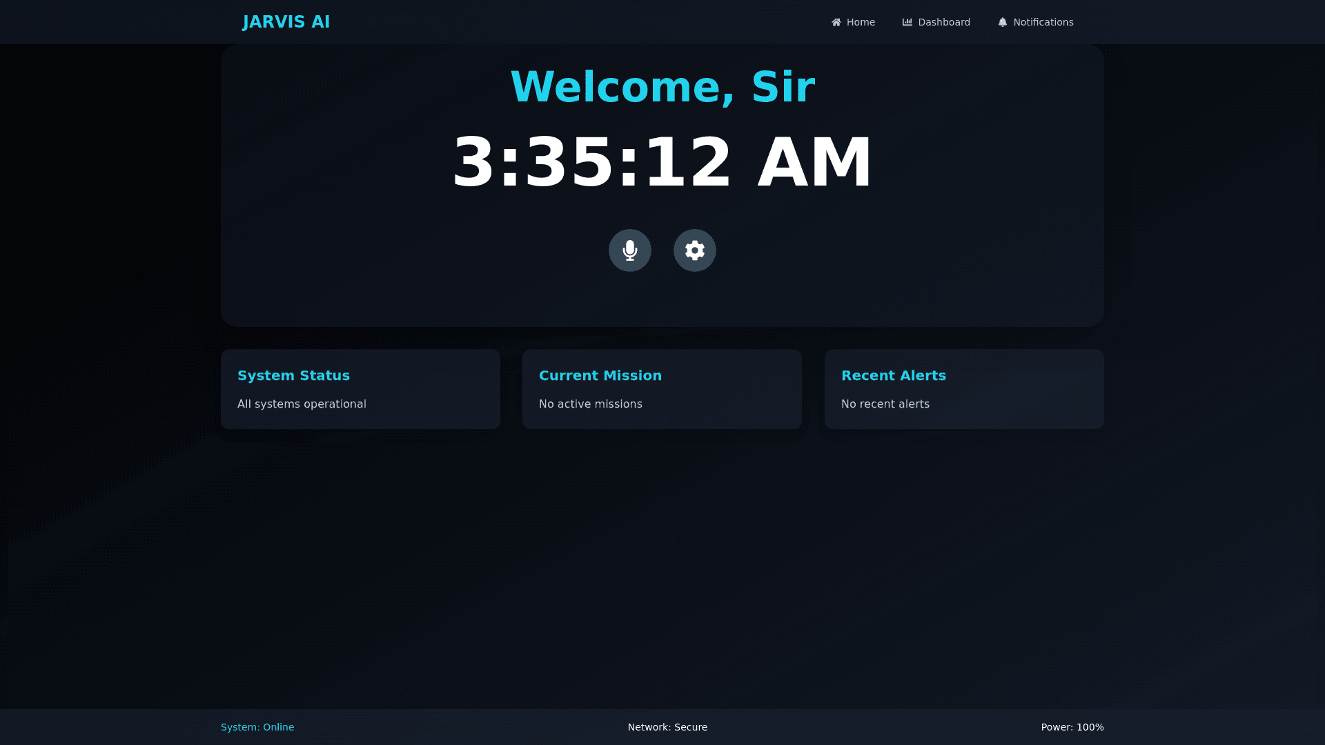
Certainly, Mr. Dafler. Below is a detailed description of the Iron Man JARVIS UI, tailored for a React and Tailwind CSS environment, ideal for generating an LLM UI: ### **Color Scheme** - **Primary Colors:** Deep Blue (#0a1f44), Soft Cyan (#00c9ff), and Neon Blue (#1ac6ff) - **Accent Colors:** Electric Blue (#00ffff), White (#ffffff), and Neon Green (#39ff14) - **Background:** Black (#000000) or very dark gray, with gradients in deep blue and subtle patterns resembling digital waves or circuits. ### **Layout & Structure** - **Navigation Bar:** - A semi-transparent, fixed navigation bar at the top with smooth transitions. - Links or icons for different sections (e.g., Home, Settings, Dashboard) that light up with a glow effect on hover. - **Main Dashboard:** - **Central Area:** A large circular or hexagonal grid that holds core UI elements like a holographic globe, network diagram, or central control hub. This area should be highly interactive with responsive 3D animations. - **Side Panels:** - Collapsible or floating side panels on both sides that provide real-time data, logs, or settings. - Panels should be semi-transparent with glowing borders and can slide in/out with a swipe or click. - **Widgets:** - Various holographic widgets for tasks, messages, system statuses, and notifications. These widgets float within the main dashboard area and can be dragged and resized. - Use shadows, blur effects, and slight parallax to give a floating, multi-layered appearance. - **Footer:** - A fixed footer with a status bar showing system diagnostics, battery levels, and network status, displayed with minimalistic icons and neon highlights. ### **Typography** - **Font:** Futuristic, sans-serif fonts like "Exo," "Orbitron," or "Titillium Web." - **Text Effects:** - Glowing text with soft neon blue and cyan glows for titles. - Subtle animations on hover, such as a fade-in/fade-out or slight color shift. ### **Animations & Transitions** - **Hover Effects:** - Icons and buttons should have a glow or pulse effect when hovered. - Text elements can underline with a neon line that animates from left to right. - **Transitions:** - Smooth, seamless transitions for opening and closing panels or modals. - Use Tailwind CSS’s `transition` and `transform` utilities to handle scale, opacity, and movement animations. - **Interactive Elements:** - Buttons and icons should have a slight scaling effect on click, with accompanying sound effects (optional). - Data visualizations like charts or graphs should animate in real-time, mimicking a holographic display. ### **3D & Holographic Effects** - **3D Layers:** - Multiple layers of elements with varying depths to simulate a holographic interface. - Use CSS `perspective` and `transform-style: preserve-3d` properties to create depth. - **Holographic Projections:** - Elements should have a translucent or semi-transparent background, with neon edges and flickering effects. - Utilize CSS animations to create a ‘scan line’ or ‘flicker’ effect, simulating a digital projection. ### **Sound Design (Optional)** - **Interaction Sounds:** - Subtle, futuristic sound effects on clicks, hovers, or notifications. - Ambient, low-volume background hum to emulate a high-tech environment. ### **Responsive Design** - Ensure that the UI is fully responsive, adapting to various screen sizes while maintaining the futuristic aesthetic. The layout should transition smoothly, with elements like side panels collapsing into icons and widgets resizing proportionally. ### **Accessibility** - **Contrast:** Maintain high contrast between text and background for readability. - **Keyboard Navigation:** Ensure all interactive elements can be accessed via keyboard shortcuts. - **ARIA Labels:** Use descriptive ARIA labels for screen readers. This detailed approach should give your LLM UI a truly immersive JARVIS-like experience in React with Tailwind CSS. Let me know if you need further elaboration or a specific implementation guide.