Learning Dashboard - Copy this React, Tailwind Component to your project
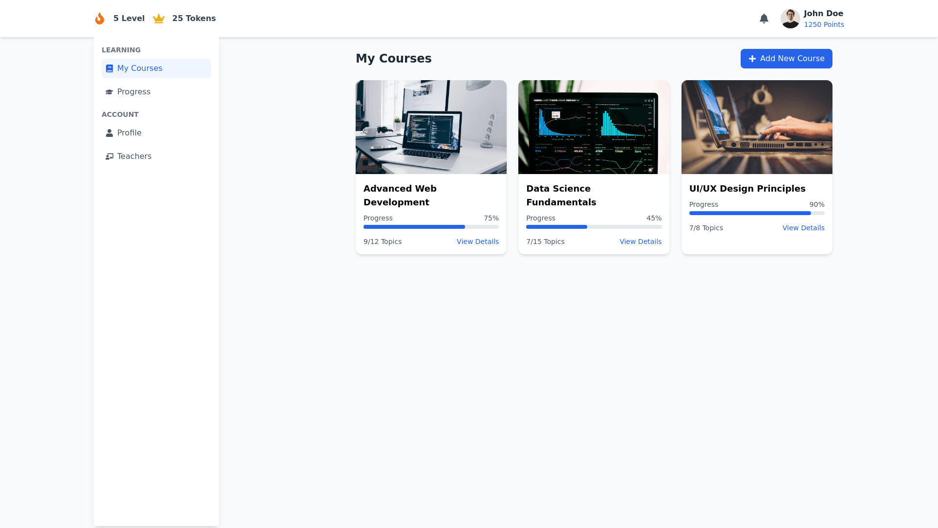
Detailed Description of Learning Dashboard Interface This Learning Dashboard Interface is designed to be modern, clean, and functional while prioritizing the user experience for students. It seamlessly organizes course details, learning progress, and account information into intuitive sections. Below is a breakdown of its components and functionality: Top Section (Header Area) User Greeting and Notification Bar: A text message congratulating the user for achieving a new milestone or encouraging them to improve (e.g., "You’ve broken your previous record for consecutive weeks of skill practice!"). Icons summarizing progress points and achievements: Fire Icon: Represents streaks or active learning days. Level Progress: A progress bar showing the user’s current level and progress towards the next. Skill Tokens: A horizontal list of tokens earned for specific skills (e.g., Science, Math, Art). Profile Overview (Right Aligned): User Avatar: A small circular image with an editable option (e.g., "Choose an avatar"). Quick links for profile editing (e.g., "Edit Profile"). Total points earned: Displayed prominently in a bright colored button for visibility. Main Body 1. Sidebar Navigation (Left Panel) A vertical navigation menu that groups features into categories for easier access. Each item has hover and active states to improve usability. Learning Section: My Classes: Lists all enrolled classes and their respective progress. Self Learning: Courses: Links to a detailed course list view. Progress: Visualizes overall progress and detailed performance. Account Management Section: Profile: Edit user details such as name, email, and password. Teachers: Connects with instructors, view teacher details or communicate. 2. Main Content Area (Dynamic Panel) The right panel dynamically updates based on the sidebar selection. For this view, the focus is on "Courses." Title Area: Bold and large section heading: "My Courses". A "Manage Courses" button placed on the right for administrative actions like enrolling or dropping courses. Course Cards (Responsive Grid): Each course is displayed in a card layout: Course Name: Large, bold title for easy identification. Progress Bar: Indicates course completion percentage in a visually appealing manner. Topics or Chapters: A compact list of modules/topics with descriptions. A "Continue" button for each module to resume learning directly. Expandable Sections: Clicking "See All" reveals a full list of topics for that course. Icons and Badges: Bright, intuitive icons representing subject matter (e.g., a calculator icon for math). Completion badges for individual chapters. 3. Additional Functionalities Course Management Button: A prominent "Add New Course" button with a "+" icon, encouraging users to explore and enroll in more courses. Accessibility: Responsive design ensures a seamless experience on both desktop and mobile devices. Use of contrasting colors for better readability and inclusive design. Color Scheme and Typography Color Palette: Shades of blue: For highlights and calls to action (e.g., buttons). Neutral whites and grays: For backgrounds and less important elements. Accent colors: Orange and green for badges and key achievements. Typography: Clean, sans serif fonts for readability. Bold headers for clear section separation.