Location Input - Copy this React, Tailwind Component to your project
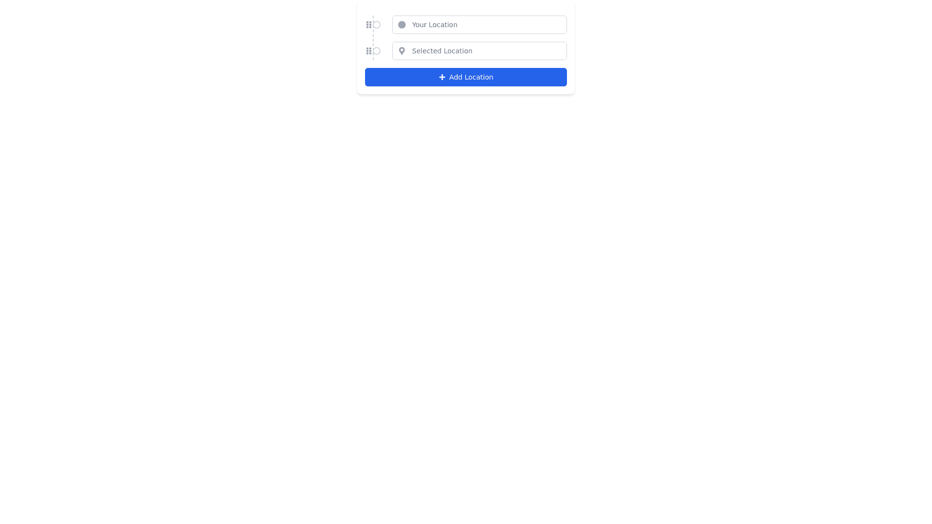
I would like to update the location selection component with the following changes: Move the dashed line: Align the dashed line all the way to the left, closer to the edge of the component, creating a more distinct separation between the location fields and the line. Add a circle representing a location: Add a circle on the dashed line for each location, making it look like a chain of locations. The dashed line should connect the circles between the locations, visually representing a path. Visual effect only: The chain effect with the circles and dashed line is purely visual and should not affect the drag-and-drop functionality of the location fields. Users should still be able to drag the fields to reorder them without breaking the chain. Please provide the updated design and implementation that reflects these changes.
