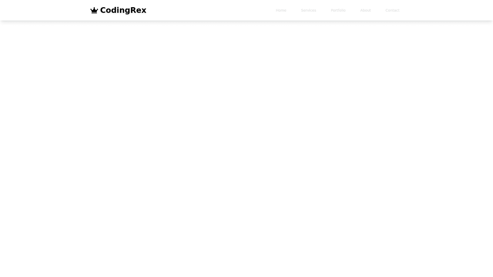
Navbar - Copy this React, Tailwind Component to your project
# UI Generation Prompt: Luxurious Responsive Navbar Create a sophisticated and responsive navbar with the following specifications: 1. Color Scheme: - Primary colors: Use a gradient blend of deep navy blue (#000080) and rich black (#010203) - Accent color: Metallic gold (#D4AF37) for highlights and interactive elements 2. Overall Style: - Aim for a luxurious, royal, and professional appearance - Incorporate subtle shimmer or glossy effects to enhance the premium feel - Use sleek, modern typography for menu items and logo 3. Logo: - Text: "CodingRex" - Font: Choose an elegant, bold sans-serif typeface (e.g., Montserrat Bold or Futura Bold) - Color: Metallic gold (#D4AF37) - Optional: Include a small crown icon or dinosaur silhouette next to or integrated with the text 4. Desktop Layout: - Full-width navbar with a height of 70-80 pixels - Logo positioned on the left side with ample padding - Menu items aligned to the right side with equal spacing - Include 4-5 main menu items (e.g., Home, Services, Portfolio, About, Contact) - Add a subtle hover effect on menu items (e.g., slight color change or underline animation) 5. Mobile Layout: - Implement a collapsible menu using a hamburger icon - Hamburger icon: Three horizontal lines in metallic gold (#D4AF37) - When tapped, the icon should smoothly transform into an "X" to close the menu - Collapsed menu should slide in from the right side of the screen - In collapsed state, display logo centered in the navbar 6. Responsiveness: - Use a breakpoint of 768px to switch between desktop and mobile layouts - Ensure smooth transition animations when collapsing/expanding the menu 7. Interactive Elements: - Add a subtle glow effect to the logo on hover - Implement a "sticky" navbar that remains at the top of the screen when scrolling - Include a slight shadow or separation line at the bottom of the navbar to distinguish it from the content below 8. Additional Details: - Use thin, elegant dividers between menu items in the desktop view - Incorporate micro-interactions, such as slight scale changes on hover for buttons or menu items - Consider adding a secondary navigation layer for less important links in a smaller font size below the main navbar (desktop view only) 9. Accessibility: - Ensure sufficient color contrast between text and background for readability - Include appropriate aria labels for the hamburger menu and other interactive elements - Implement keyboard navigation support for menu items Remember to maintain a balance between luxury and usability, prioritizing a clean and intuitive user experience while incorporating the requested royal and shiny aesthetic.
