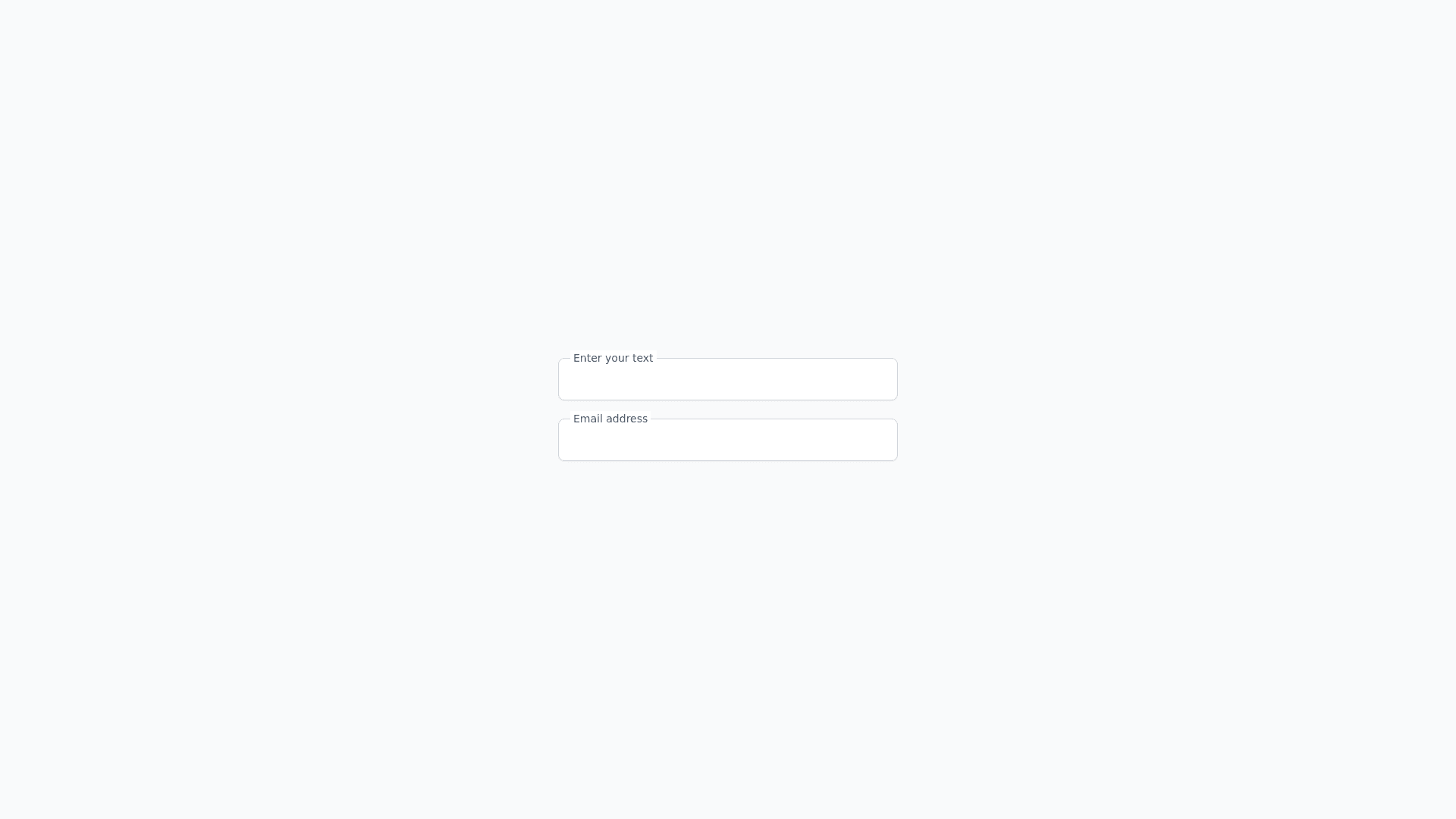
Material Floating Input - Copy this Html, Tailwind Component to your project
Generate-HTML-and-CSS-(using-Tailwind-CSS)-code-for-a-Material-Design-inspired-input-field-with-a-floating-label-that-remains-positioned-at-the-top-by-default.-The-input-should-feature:-Input-Field-Structure-A-container-with:-An-input-field-for-text-entry.-A-floating-label-at-the-top-by-default,-styled-to-remain-visible-above-the-input-even-when-it’s-empty.-Use-a-light-color-theme-(e.g.,-bg-white,-text-gray-700)-and-a-subtle-accent-color-for-the-border-(e.g.,-border-blue-500)-when-the-input-is-focused.-Add-an-underline-or-a-light-border-around-the-input-with-rounded-corners.-Floating-Label-Design-The-label-should-appear-at-the-top-of-the-input-by-default-and-should-be-smaller-than-regular-text.-When-the-input-is-focused-or-has-text,-the-label-should-be-emphasized-with-a-color-change-(e.g.,-text-blue-500)-and-stay-at-the-top.-Use-text-xs-for-the-label-to-achieve-a-small,-refined-look-at-the-top-of-the-input.-Hover-and-Focus-Effects-The-input-should-have-a-border-accent-(e.g.,-border-gray-300)-by-default,-which-changes-to-a-primary-color-(e.g.,-border-blue-500)-when-focused.-The-label-should-have-a-smooth-transition-to-the-accent-color-(text-blue-500)-on-focus.-Add-subtle-shadow-and-transition-effects-for-a-polished-interaction,-using-classes-like-transition-all-and-duration-300.-Responsive-and-Accessible-Design-The-input-should-adapt-to-different-screen-sizes-and-remain-user-friendly-across-devices.-Ensure-keyboard-accessibility-so-that-users-can-tab-into-the-input,-and-the-label-remains-in-the-correct-position.-Tailwind-Classes-to-Use-Use-Tailwind-classes:-relative,-border,-rounded-md,-p-2,-text-gray-700,-bg-white-for-layout-and-colors.-text-xs,-absolute,-top-0,-left-2-for-positioning-the-label.-focus:border-blue-500,-transition-all,-duration-300-for-smooth-interactions.-Provide-the-HTML-and-CSS-(using-Tailwind-CSS)-code-for-this-modern-input-component-with-a-floating-label-that-stays-at-the-top-by-default-and-has-Material-Design-inspired-hover-and-focus-effects.
