Styled App Bar - Copy this React, Tailwind Component to your project
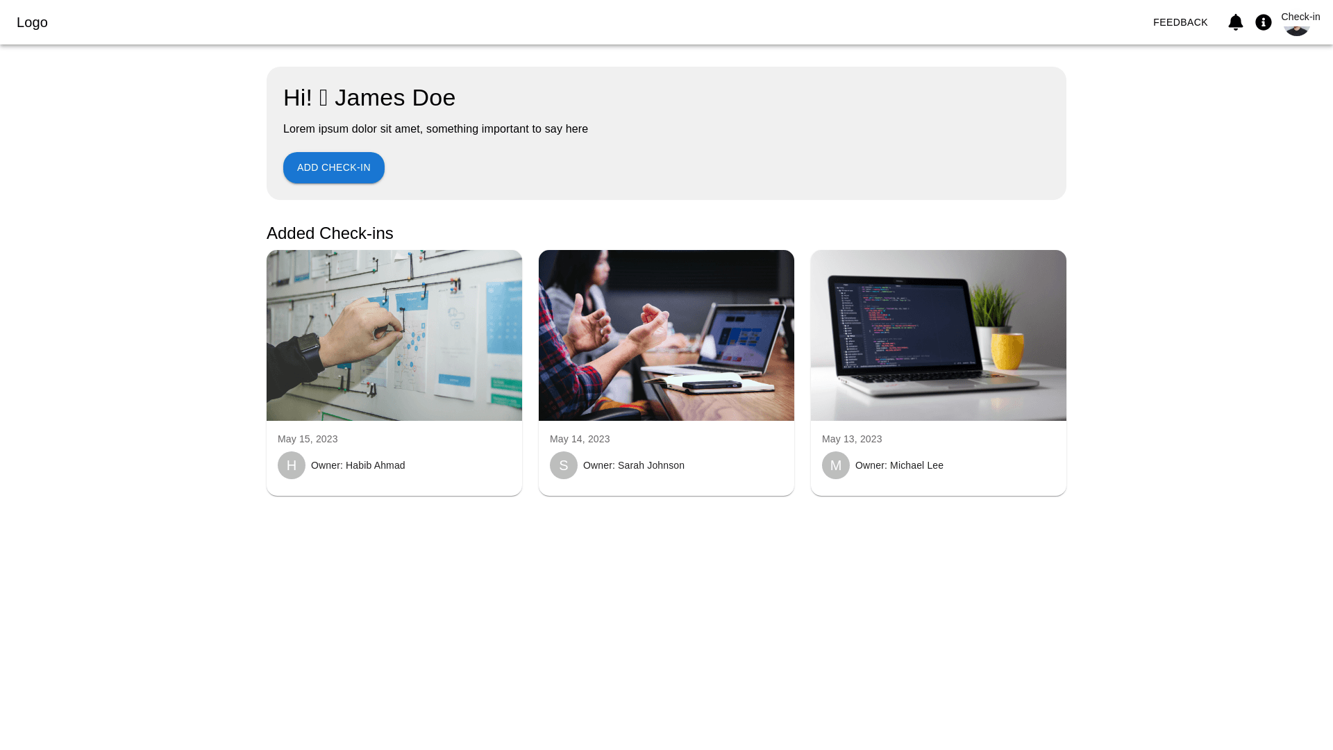
Design a modern, responsive web interface using Material Design principles. The top navbar should have a logo on the left, and on the right, include a feedback button, a bell icon for notifications, an information ("i") icon, and a dropdown avatar for user settings. Below the navbar, create a large, rounded banner with left and right margins. On the left side of the banner, display the greeting "Hi! 👋 James Doe" with a smaller text below it: "Lorem ipsum dolor sit amen, something important to say here". Beneath that, add a prominent rounded button labeled "Add Check in". After the banner, add a heading "Added Check ins" followed by multiple cards arranged vertically. Each card should feature an image at the top with a "Check in" overlay on the top right corner of the image. Below the image, display the date and a rounded user avatar along with the label "Owner: Habib Ahmad". Repeat this card layout with multiple instances, each having randomized data for images and owner names, while keeping a consistent design. Ensure the layout is clean, with smooth spacing, and fully responsive for different screen sizes.
