Mens Product Page - Copy this React, Tailwind Component to your project
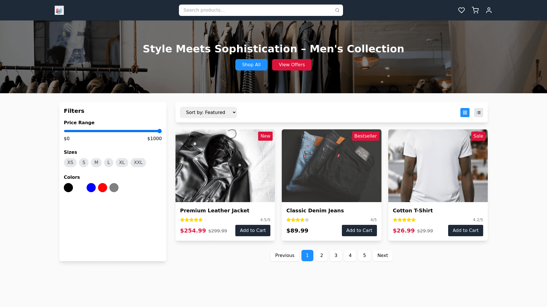
Men’s Product Filtering Page Theme and Style Bold, modern, and masculine look: Dark tones (black, navy, dark grey) with vibrant accent colors like deep blue (#1E90FF) or metallic gold (#FFD700). Typography: Bold sans serif fonts for headings, clean and minimal for descriptions. Interactive elements: Use subtle animations like hover effects, color transitions, and parallax scrolling. Page Structure 1. Navigation Bar (Sticky) Elements: Logo (left) Search bar (center) with auto suggestions for products. Icons for cart, profile, and wishlist (right). Filters and sorting options integrated into the sticky bar for easy access. Interactive Features: Smooth dropdown for sort options (e.g., “Price: Low to High,” “Popularity”). 2. Hero Section (Optional) Tagline: “Style Meets Sophistication – Men’s Collection” (center aligned). Background: Parallax image of a man in a sleek outfit (e.g., suit, leather jacket). CTA Buttons: “Shop All,” “View Offers,” and “Apply Filters.” 3. Filters Section (Left Sidebar) A clean, expandable sidebar with unique interactive elements: Filter Categories Price Range: A glowing slider with real time price updates as the user adjusts it. Color Options: Display color swatches with tooltips showing the color name on hover. Size Options: Use clickable size buttons (S, M, L, XL, XXL) styled like tags. Active states highlighted with a glowing border. Material/Category: Interactive toggle buttons for material types (e.g., cotton, denim, leather). Brand: A dropdown or checkbox list of popular brands with a search bar for quick access. Ratings: Interactive star slider to filter products by ratings (e.g., 4 stars & up). 4. Product Display Grid Card Design (Interactive) Hover Effects: On hover, zoom in on the product image and display alternate views. Quick action buttons (Add to Cart, Add to Wishlist) slide up on hover. Card Elements: Product Image: High resolution with hover zoom. Product Name: Bold font. Price: Show discounted price with original price struck through. Labels: Badges like “New Arrival,” “Trending,” or “50% Off.” Rating: Display star ratings under the price. Grid Features Dynamic Layout: Toggle between grid view (2, 3, or 4 products per row) and list view. 5. Sorting Bar (Above Grid) Dropdown for sorting: “Price: Low to High,” “Price: High to Low,” “New Arrivals,” “Most Popular.” Toggle buttons: Grid or List view. Number of products per page (e.g., 10, 20, 50). 6. Sidebar Promotions A vertical promotional banner integrated into the filters sidebar: Example: “Exclusive Offer: Flat 30% Off on Men’s Jackets!” 7. Pagination (Below Grid) Modern pagination style: Highlight the current page with a vibrant color. Add next/previous buttons with hover effects. 8. Sticky Floating Filter Button (For Mobile) A floating button at the bottom right corner for mobile users: Opens a full screen filter overlay with collapsible sections. Interactive Features Real Time Updates: Products dynamically update when a filter is applied (no page reload). Hover Animations: Subtle glowing effect or color change on buttons. Lazy Loading: Products load as the user scrolls for a smoother experience. Color Palette Example Primary: Dark Navy (#1E2A38), Metallic Silver (#BCC6CC). Accent: Deep Blue (#1E90FF), Gold (#FFD700), or Crimson Red (#DC143C). Background: Neutral tones like Off White (#FAFAFA). Additional Enhancements Wishlist Feature: Allow users to save products for later. Live Search: Typeahead functionality with image and price previews. Quick View: Hovering over a product reveals a button to see details in a popup.