Web Component - Copy this React, Tailwind Component to your project
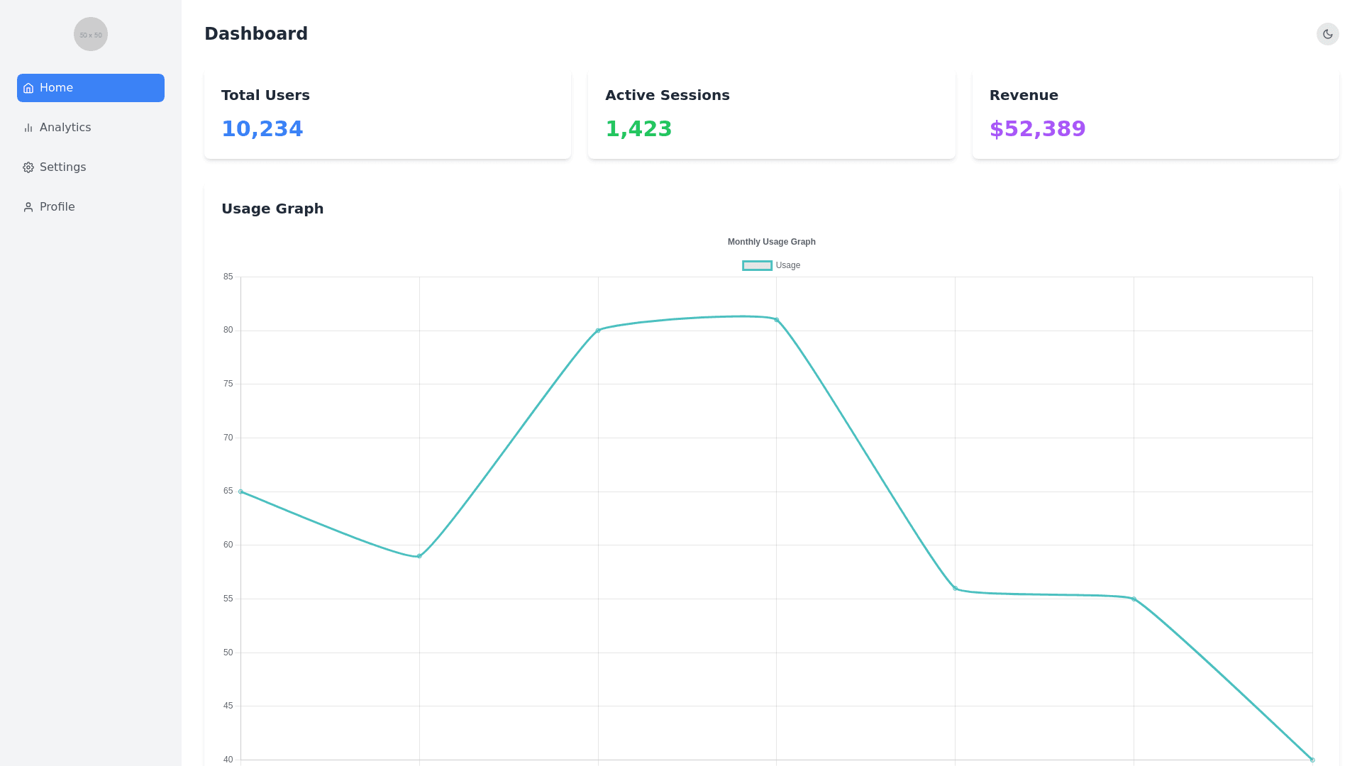
Design a modern and sleek interface with a left side panel that contains sections for "My Profile," "Settings," and "Usage." The page should have a clean, minimalist aesthetic, using a subtle and cohesive color palette of muted tones, such as soft grays, blues, and whites, with optional accent colors for highlights. Left Panel: The left panel should be styled with a slightly darker background than the rest of the page, such as a muted dark gray or blue, to distinguish it while maintaining visual harmony. The panel should be vertically oriented, with "My Profile," "Settings," and "Usage" sections listed one below the other. Each section header should be in a bold, readable font with subtle hover effects, such as a slight background color change or underline to indicate interactivity. My Profile: Under "My Profile," display the user's email address and name in a clear, readable font. The text should be slightly indented from the section header, with ample padding around it for a clean and spacious layout. The font color should be light, such as white or light gray, to contrast with the darker panel background. Optionally, include a small profile picture or icon next to the name for a more personalized touch. Settings: The "Settings" section should contain a mode toggle switch that allows users to switch between dark and bright modes. The toggle switch should have a modern design, with a smooth sliding animation. When toggled, the entire page should smoothly transition between dark and bright modes, with the color scheme adjusting accordingly. Below the mode toggle, you can include other settings options, such as notifications or account preferences, presented as simple switches or dropdown menus. Each option should have a minimalist design, with intuitive icons or labels. Usage: The "Usage" section should feature a graph that visually represents the user's usage data, such as the number of items used and the cost incurred so far. The graph should be modern and easy to understand, using a clean design with muted colors that fit the overall page aesthetic. Consider using a bar chart, line graph, or combination chart that allows users to see trends over time. The graph should be interactive, with hover effects that display detailed data points or tooltips for better insight. Below the graph, include a summary of the key statistics, such as total items used and total cost, presented in bold, readable text. Overall Layout: The left panel should be collapsible to maximize screen space, especially on smaller devices. When collapsed, the panel could be reduced to icons for "My Profile," "Settings," and "Usage," with a smooth animation that slides the panel in and out. The entire page should have a responsive design, ensuring that all elements, including the left panel, mode toggle, and graph, adjust gracefully to different screen sizes and orientations. The design should maintain a modern, cohesive look across all devices, with a focus on usability and accessibility. Apply subtle animations and hover effects throughout the page, such as smooth transitions, slight shadowing, or color shifts, to enhance the user experience while keeping the interface visually appealing and easy to navigate.