Note App - Copy this React, Tailwind Component to your project
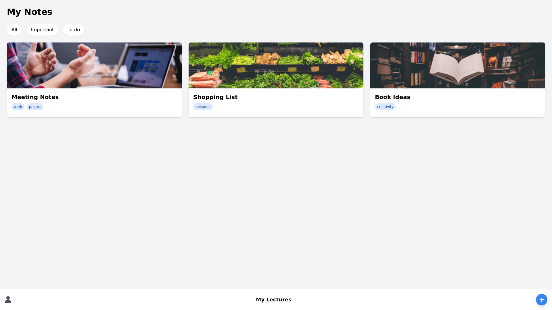
Fully funtional modern note app UI with three different pages. Here's a detailed description of each page: 1. Home Page (Left) Title: "My Notes" in bold at the top. Category Filters: Beneath the title, there's a filter bar with categories such as "All," "Important," and "To do" to organize notes. Note Cards: The notes are displayed in vibrant, rounded cards. Each card includes a title (e.g., "Plan for the Day"), tags (like "Work," "Gym"), and image previews. The cards are in various colors to visually separate them. Navigation Bar: At the bottom, there is a circular profile icon on the left, followed by the "My Lectures" section in the center, and a rounded "+" button on the right, suggesting note creation. 2. Note Details Page (Middle) Note Title: The title "Design Sprint Lecture" is displayed prominently at the top. Collaboration/Sharing: There are icons for sharing or adding collaborators to the note next to the title. Note Content: The main content includes a mix of text and image, with icons at the bottom for adding more media (like pictures, audio, etc.), or performing actions (editing or deleting the note). Minimalistic: The background is a pale cream color, and the note itself looks clean, with ample space for the content. 3. Editing Page (Right) Edit Mode: The page appears to be in an editing state, allowing users to modify text. Keyboard Display: At the bottom, a keyboard interface is shown, allowing the user to type in new content. Highlighted Text: A portion of the text is highlighted in yellow, suggesting it can be edited or highlighted for emphasis. There are also formatting options like bolding, underlining, etc. Header Section: At the top left, there's a subtle back arrow icon, likely for returning to the previous screen. Overall Design: Color Palette: The app uses a modern, muted color palette with splashes of vibrant colors for the notes, making the design clean yet engaging. Rounded Elements: Most UI elements have smooth, rounded edges, contributing to the soft, user friendly feel. Minimalistic Controls: The buttons and icons are minimal, focusing the user's attention on the notes themselves.
