Mood Chat - Copy this React, Tailwind Component to your project
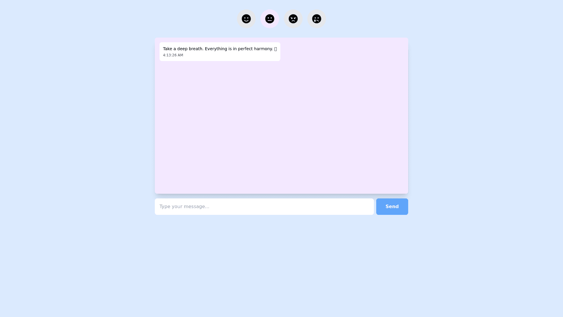
**Create a UI/UX design for a mood based chat app that adjusts its interface, animations, and AI tone based on the user's emotional state. The app should dynamically change its theme to match four primary moods: Happy, Calm/Neutral, Anxious/Frustrated, and Sad. Each mood should be visually distinct, providing an emotionally supportive environment that enhances the user experience. Below are the specifications for each mood:** ### 1. **Happy Mood (Motivated, Joyful):** **Colors**: Use bright, warm hues such as yellow, orange, and light green. These colors should feel energetic and uplifting. **Font Style**: Choose playful, rounded fonts that feel friendly and light hearted (e.g., Poppins, Comic Sans). **Buttons**: Design dynamic, interactive buttons with playful micro interactions like slight bounce effects or color shifts when clicked or hovered. **Animations**: Incorporate small confetti effects or celebratory icons when tasks are completed. Use subtle, joyful transitions (e.g., slide up or pop in) between screens. **AI Tone**: Uplifting, motivational, and positive. The AI should offer encouragement with phrases like: *“Great job! You're on fire today!”* *“Awesome! Keep it up!”* ### 2. **Calm/Neutral Mood (Content, Relaxed):** **Colors**: Use soft blues, greens, and muted purples to create a peaceful and calming atmosphere. **Font Style**: Opt for simple, sans serif fonts (e.g., Helvetica, Arial, Lato) that are easy to read and clear. **Buttons**: Design minimalist buttons with smooth transitions like gentle fading effects when clicked or hovered. **Animations**: Implement smooth, slow transitions between screens and actions. Animations should be subtle, without any sharp or jarring movements. **AI Tone**: Gentle, soothing, and supportive. Use phrases like: *“Take your time, there’s no rush.”* *“You’re doing great. Everything is okay.”* ### 3. **Anxious/Frustrated Mood (Stressed, Angry, Overwhelmed):** **Colors**: Incorporate darker tones like deep reds, blues, or grays. The colors should evoke a serious and calming atmosphere. **Font Style**: Use bold, thicker sans serif fonts (e.g., Impact, Roboto Bold) for clarity and emphasis. Avoid overly stylized fonts to keep the experience straightforward and functional. **Buttons**: Large, easy to press buttons with ample spacing and subtle hover effects. Avoid overly decorative buttons; focus on simplicity and ease of interaction. **Animations**: Keep animations to a minimum. When transitioning between screens or interactions, use slow, smooth animations (e.g., fade or slide transitions). **AI Tone**: Reassuring, calming, and grounded. The AI should provide phrases like: *“Take a deep breath, we’ll get through this.”* *“Let’s focus on one step at a time. You’re doing great.”* ### 4. **Sad Mood (Depressed, Lonely):** **Colors**: Use soft pastels or muted tones like light gray, lavender, or pale blue to create a nurturing and calming effect. **Font Style**: Soft, rounded fonts (e.g., Nunito, Comfortaa, Quicksand) to give a feeling of warmth and empathy. **Buttons**: Design large, soft gradient buttons with centered text. Buttons should feel secure and easy to interact with. **Animations**: Implement slow, gradual animations like gentle fades or smooth transitions to avoid overwhelming the user. **AI Tone**: Soft, empathetic, and supportive. Use comforting phrases like: *“You’re not alone, I’m here for you.”* *“Take your time. There’s no rush.”* **Design Notes**: The overall interface should be clean, intuitive, and easy to navigate, with a strong focus on accessibility. Ensure that interactions feel smooth and fluid, and that the experience is tailored to each mood in a non intrusive way. Ensure that each mood shift is subtle but noticeable enough to offer the user a tailored experience.