Mood Based Chat - Copy this React, Tailwind Component to your project
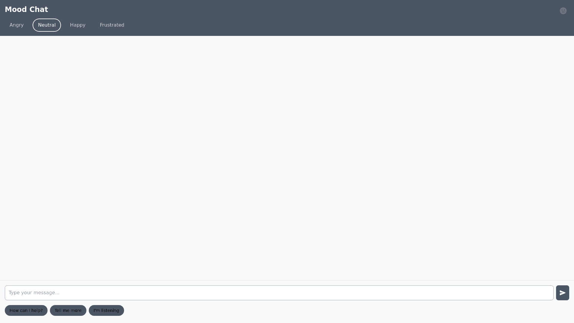
UI and Design Requirements 1. UI Themes Based on Mood: Angry Mood: Color Scheme: Soft purple, deep blue. Font Style: Medium weight, easy to read fonts. UI Components: Larger buttons with a subtle shadow. Minimal distractions. Animations: No fast moving animations. Calm transitions. Neutral Mood: Color Scheme: Grey, white, and black tones. Font Style: Standard font weights, consistent spacing. UI Components: Regular button sizes, moderate contrast. Animations: None or minimal. Happy Mood: Color Scheme: Light yellow, green, orange. Font Style: Bold, friendly fonts with rounded edges. UI Components: Slightly bigger buttons, small animations (e.g., hover effects, smooth transitions). Animations: Fun and smooth animations, e.g., icons bouncing when clicked. Frustrated Mood: Color Scheme: Light blue, soft green. Font Style: Simple, straightforward text with easy to read font. UI Components: Larger touchpoints for mobile, simple navigation. Animations: Slow and smooth transitions, no sudden movements. 2. Mood Indicator: Mood Tracker: A small indicator bar or icon that changes color and shape as the user’s mood transitions. For instance: Angry: Red or dark colors. Happy: Green or yellow. Neutral: Grey. Frustrated: Blue or purple. Mood Indicator Placement: Positioned near the chat input or at the top of the UI as a floating badge. 3. User Interaction Flow: Chat Interface: Main chat window with text input field. Predefined quick replies based on the user’s mood (e.g., "I understand you're upset" for anger, or "Let’s get started!" for happiness). Mood Setting Button: Positioned near the chat input field, allowing the user to manually change their mood if they feel misrepresented by the AI. Exit Flow: After the user ends the conversation, show a thank you message, which could also reflect the user’s mood, e.g., "Thank you for chatting! We hope you feel better now."