Drawer Width - Copy this React, Mui Component to your project
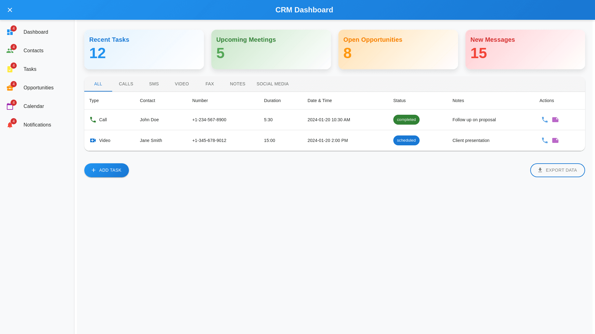
To make the design fully functional and responsive, here are some recommendations: 1. Responsive Design Implementation: Sidebar (Menu): Use collapsible navigation for the sidebar so that it adjusts for smaller screens. On mobile screens, the sidebar should become a hamburger menu to save space. Ensure the sidebar buttons are large enough for easy tapping on mobile. Dashboard Cards (Recent Tasks, Upcoming Meetings, etc.): For smaller screens, these cards should stack vertically instead of being aligned horizontally to save space. Use flexbox or CSS grid to adapt the layout dynamically. 2. Communication Table: Table Responsiveness: Implement horizontal scrolling for smaller screen widths to avoid content clipping. Use media queries to adjust font size and padding for better visibility on mobile devices. Dropdowns and Filters: The communication type filter (Call, SMS, Video, etc.) should display as a dropdown that fits nicely in smaller screens. Buttons for actions (e.g., Add Task, Export Data) should be sticky at the bottom on mobile screens or adapt to the screen size with larger touch-friendly buttons. 3. Icons and Colors: Use clear and distinguishable icons with a consistent color scheme, ensuring they are visible across devices. For instance, use bold icons for easy navigation on mobile. Maintain consistent color coding (e.g., Green for Completed, Red for Missed, Blue for Scheduled) for status indicators across mobile and desktop versions. 4. Interactivity & User Experience: Add hover effects on desktop and tap animations for mobile to improve user interaction. Tooltips on hover or tap for icons that may not be obvious (e.g., phone, video icons) to clarify their functionality. 5. Task Management: On mobile devices, implement an expandable card layout for the tasks list so that users can see task details (e.g., duration, date, status) without overwhelming the screen. 6. Performance Optimization: Make sure images and icons are optimized for faster loading, especially on mobile networks. Use lazy loading for non-critical assets to improve page speed on mobile devices. 7. Mobile-Specific Enhancements: Use a bottom navigation bar for quick access to core features (e.g., Dashboard, Tasks, Notifications) in mobile view. Ensure that the font sizes and spacing are adjusted for legibility on smaller screens. By incorporating these suggestions, the CRM dashboard can be made fully functional, user-friendly, and responsive, providing a smooth experience across devices from desktops to mobile phones.