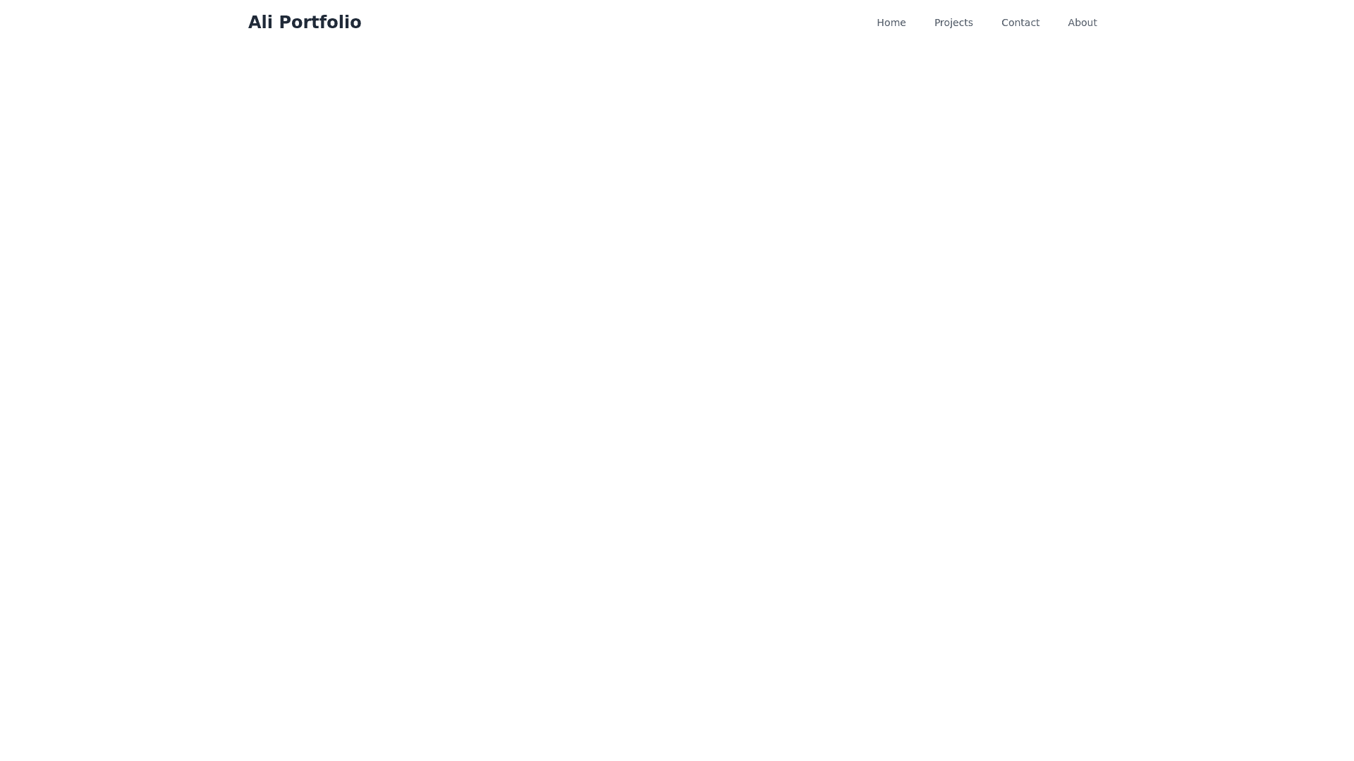
Navbar - Copy this React, Tailwind Component to your project
Navbar Animation: You want a navigation bar with some kind of animation effect when users interact with it. This could mean: The links change color or have an underline effect on hover. The navbar changes its appearance (e.g., a dropdown or sliding effect) when switching from desktop to mobile view. Responsiveness: The navbar should adjust and look good on different screen sizes, such as: Mobile: On mobile devices, the navbar might collapse into a hamburger menu or take up less space. Laptop: On larger screens, the navbar might display fully, with all links visible. Tablet: The design should fit tablet dimensions comfortably, possibly switching between mobile and desktop layouts depending on the screen width. Logo: You mentioned a logo that says "Ali Portfolio" in bold text. This will be a part of the navbar, likely on the left side. Menu Links: Your navbar will have the following links: Home Projects Contact About These links will lead to different sections of your portfolio website. You can add smooth scroll behavior or link them to different pages
