Reports - Copy this React, Tailwind Component to your project
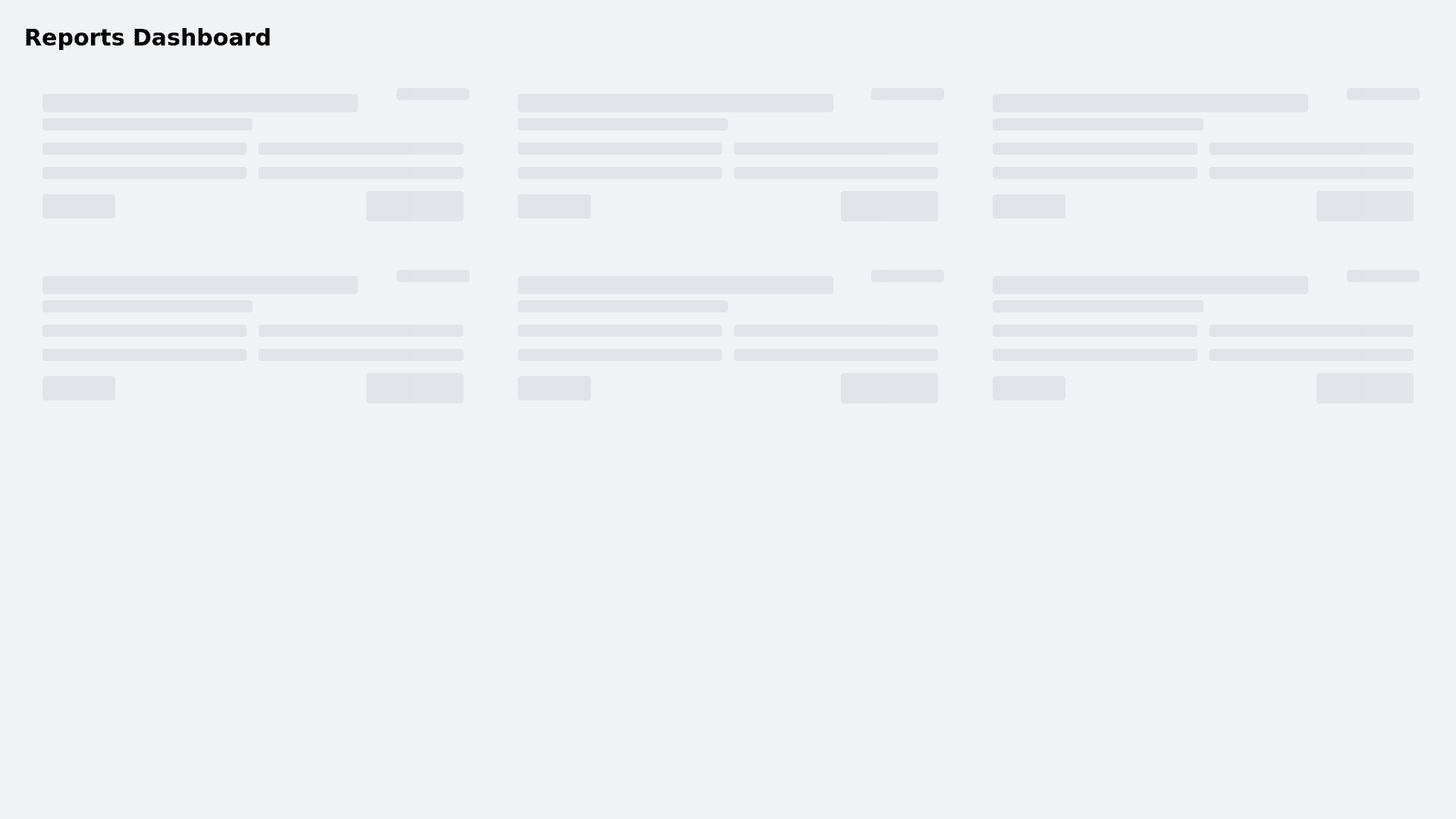
Create a modern neomorphic dashboard interface for displaying reports with the following specifications: Visual Style: - Implement floating report cards using neomorphic design (light source from top-left) - Apply soft inner shadows (8px, rgba(0,0,0,0.1)) for depth - Use a neutral background color (#f0f2f5) for optimal shadow contrast - Maintain consistent padding (24px) and border radius (12px) across elements Report Card Features: - Group reports by category (Financial, Operations, Analytics, etc.) - Include expandable preview sections with smooth transition (300ms ease-out) - Display report metadata: date, author, file size, and type - Add status badges with distinct colors: • New: blue (#2196f3) • Read: gray (#9e9e9e) • Urgent: red (#f44336) Interactive Elements: - Implement a download button with press animation: • Scale to 0.98 on press • Add subtle shadow transition • Include success feedback animation - Add hover state with slight elevation increase - Ensure all interactive elements have visible focus states Loading States: - Create shimmer loading animations: • Gradient animation (linear-gradient) • 1.5s duration, infinite loop • 70% to 90% opacity range - Apply loading state to card skeletons before content loads Accessibility: - Maintain WCAG 2.1 AA contrast ratios - Include proper ARIA labels for interactive elements - Ensure keyboard navigation support
