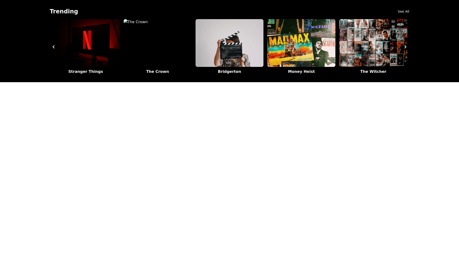
Netflix Carousel - Copy this React, Tailwind Component to your project
Prompt for Netflix Style Carousel 1. Carousel Container: Create a full width container for the carousel, ensuring it adjusts responsively to different screen sizes. Set a fixed height (e.g., 300px) to maintain a consistent look across various devices. Use CSS flexbox or grid layout for horizontal scrolling. 2. Trending Section Header: Add a section title "Trending" at the top left of the carousel, styled similarly to Netflix's font. Include a "See All" link on the top right for users to view more trending content. 3. Carousel Items: Each item in the carousel should represent a movie or TV show, styled as a rectangular poster. Set a fixed width (e.g., 150px) for each item to maintain uniformity. Include a hover effect on each item to scale up slightly (e.g., scale(1.1)) and add a slight shadow effect for emphasis. Display the title of the movie/show below the poster in a bold font. 4. Hover Effects: When hovering over an item, display additional information such as: Rating Genre Description (brief, 1 2 lines) Play button icon that enlarges or animates on hover. 5. Navigation Controls: Include left and right arrow buttons on the sides of the carousel to navigate through items. Ensure that clicking an arrow moves the carousel by 5 items at a time for smoother navigation. 6. Responsive Design: Use media queries to adjust the size of the carousel items based on screen width: On mobile devices: Display 2 items at a time. On tablet devices: Display 3 items at a time. On desktop: Display 5 items at a time.
