Newsletter Subscription - Copy this React, Tailwind Component to your project
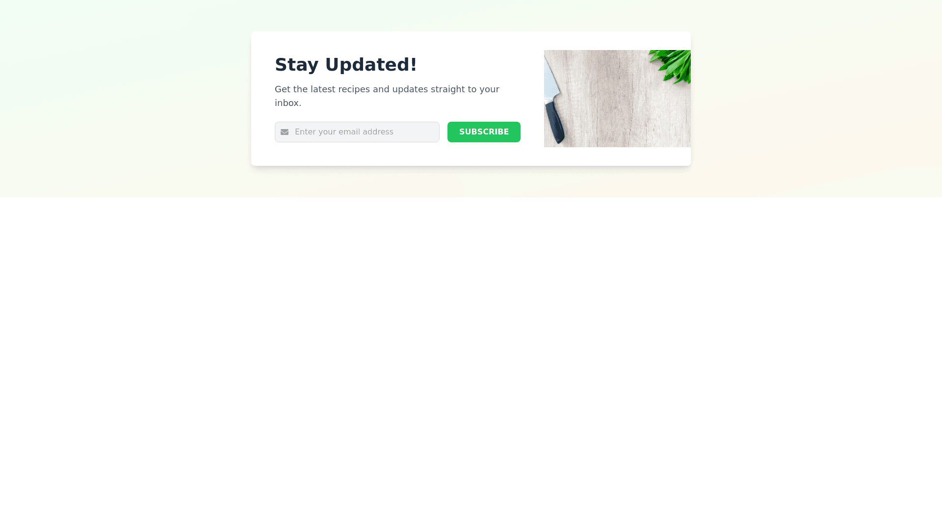
Design a modern, professional looking Newsletter Subscription Section for a food blog using React and TailwindCSS. The section should be visually appealing, clean, and fit seamlessly with the blog’s overall aesthetic. Consider the following design elements: Background and Layout: Use a full width section with a subtle gradient or light background color (e.g., soft pastels or a light gray) for contrast. Add a slightly curved or angled top and bottom edge for a modern look. Center the content both vertically and horizontally using flexbox or grid. Heading and Subheading: Include a bold, large heading like 'Stay Updated!' or 'Subscribe to Our Newsletter' in a modern, legible font (e.g., sans serif). Underneath, add a smaller subheading that encourages users to subscribe, like 'Get the latest recipes and updates straight to your inbox.' Input Form: Add an email input field that is large, rounded, and well spaced. Use a placeholder like 'Enter your email address' in light gray text. The Submit button should be visually prominent (using Tailwind's bg primary, text white, and rounded lg classes). It should have a hover effect that changes its color subtly (hover:bg secondary). Text on the button should say 'Subscribe' in bold, uppercase letters. Visual Enhancements: Add icons next to the input field or in the background (e.g., an envelope or mail icon). Use shadows and a slight elevation on the form box to make it stand out without being too overwhelming. Optionally, include a small image or food themed illustration on the right side of the section for visual appeal, or use a background image with reduced opacity for texture. Colors and Styling: Use a consistent and pleasing color palette (e.g., soft greens, pastel oranges, or modern food related colors). Make sure the button has enough contrast to draw attention while complementing the design. (#F59E0B or #34D399 for the button could work well). Keep typography clean and aligned (use Tailwind's font bold, text xl, text gray 800 for the heading and subheading). Responsive Design: Ensure that the form is mobile friendly, with stackable inputs and buttons for smaller screens (flex col md:flex row for the layout). Optimize padding and spacing with Tailwind’s responsive utilities (p 8 md:p 16) to maintain clean spacing on all screen sizes. Optional Success Message: On form submission, show a small toast notification or an inline success message like 'Thank you for subscribing!' with a friendly icon. Ensure this section is visually balanced with ample white space and designed to capture user attention without overwhelming the rest of the page.