TS
Tom Sroka
Styled Box - Copy this React, Mui Component to your project
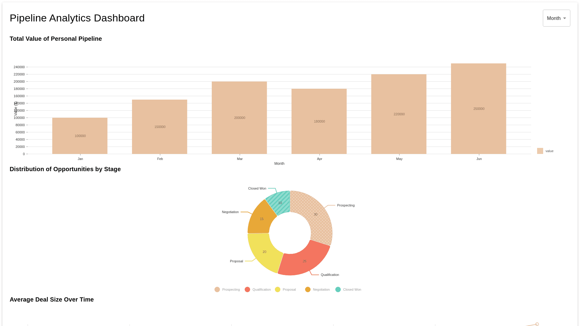
Create a @nivo chart with the following parameters: Metrics: Total value of personal pipeline, number of opportunities, average deal size. Filters: Week/Month/Quarter/Year Visual Representation: Bar Chart: Display the total value of the pipeline segmented by week, month, quarter, or year. Pie Chart: Show the distribution of opportunities by stage (e.g., Prospecting, Qualification, Proposal, etc.), providing a quick view of where most of the pipeline value lies. Line Graph: Plot the average deal size over time, allowing the Account Executive to see trends and identify periods of larger or smaller deals.
Prompt