Notifications Components - Copy this React, Tailwind Component to your project
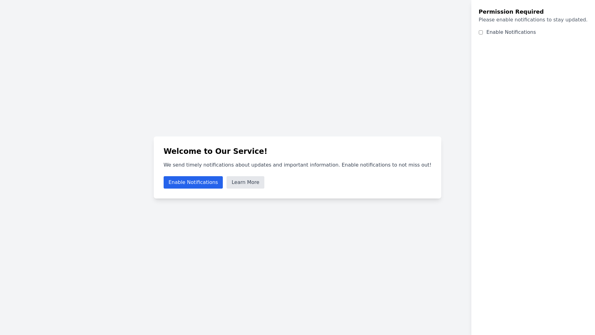
Here are 5 detailed prompts for generating larger, more comprehensive notifications permission components: 1. Create a full screen notifications permission modal with a clear message about the benefits of staying updated. Include a prominent button for users to enable notifications and a secondary option for those who prefer not to receive alerts. 2. Design a detailed notifications permission component that slides in from the bottom of the screen. This should include a summary of what kind of notifications users will receive, such as updates, offers, or reminders, with a bold call to action button to opt in. 3. Build an interactive notifications permission page with a welcoming headline and a short description explaining why users should allow notifications. Incorporate visually appealing graphics and two buttons: one for enabling notifications and another for learning more about the benefits. 4. Develop a notifications permission sidebar that appears on the right side of the screen. Include a clear explanation of what notifications will be used for, such as breaking news or exclusive offers, and provide a straightforward toggle switch for users to enable or disable notifications. 5. Create a notifications permission overlay that covers the entire screen with a concise message about the importance of notifications for real time updates. Add an engaging graphic and two action buttons: one to accept and enable notifications, and another to decline with a link to more information.
