Property Listing - Copy this React, Tailwind Component to your project
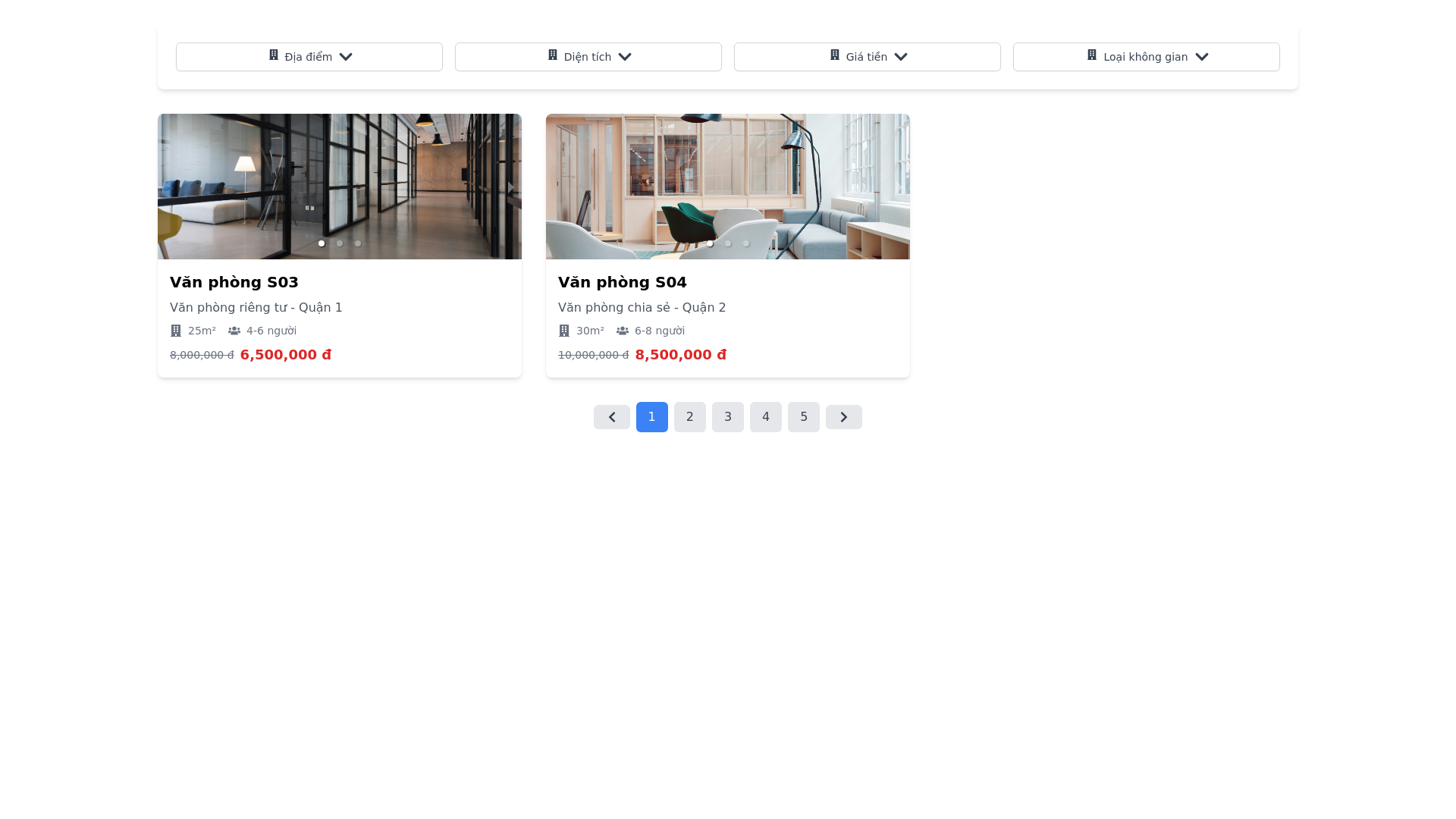
Layout Breakdown: Top Filter Section: Filter Categories: There are 5 dropdown filters horizontally arranged at the top of the page. Filter labels: Địa điểm (Location) – A dropdown with multiple selection. Diện tích (Area) – A dropdown with multiple selection. Giá tiền (Price) – A range filter (for price selection). Loại không gian (Space type) – A dropdown with multiple selection. All filters have a clean, rounded white box design and icon indicators for dropdowns. Filters allow for multiple selections except for price, which is a range slider. Filters have a soft shadow effect around them to distinguish them from the background. Main Listing Area: Cards: Each listing is displayed as a card with: Image carousel at the top: Users can swipe between multiple images for each listing. Title: Each office has a title like Văn phòng S03, styled in bold text. Subtitle: Describes the type of office (e.g., "Văn phòng riêng") and its location (e.g., "cirCO Đà Nẵng City Centre"). Room details: The size (e.g., "24 m²") and capacity (e.g., "11 Chỗ ngồi") are displayed using icons. Pricing: Shows both the original price (struck out) and the discounted price below in bold, using red color for emphasis. Action: No direct call to action buttons are shown (e.g., no "Book" or "View Details" buttons). The overall style is modern and minimalistic with white backgrounds and light grey borders between elements. The fonts are clean, likely sans serif, giving it a professional and polished appearance. Pagination: At the bottom, there is a pagination bar with numbered pages and arrows for navigation. It uses a clear design with the current page highlighted in blue. Color Scheme: Primary Colors: White background for most sections (including cards and filters). Soft grey for borders and pagination elements. Dark blue or navy for interactive elements like buttons and the pagination highlight. Secondary Colors: Red is used for displaying discounts, making it stand out from the rest of the pricing information. Black text for titles and descriptions, with lighter grey for details (e.g., capacity and size). Hover effect: Likely uses a light grey background to highlight selectable elements like filters or cards. Additional Details: Multiple Image Carousel: The top section of each card contains a carousel that users can interact with to see more images of the office. The carousel includes arrows for navigation between images. Icons: Small, intuitive icons are used to display room details like the size (square meters) and seating capacity. Price Display: Prices are presented with the original price crossed out and the new discounted price highlighted in red below.