Styled Card - Copy this React, Mui Component to your project
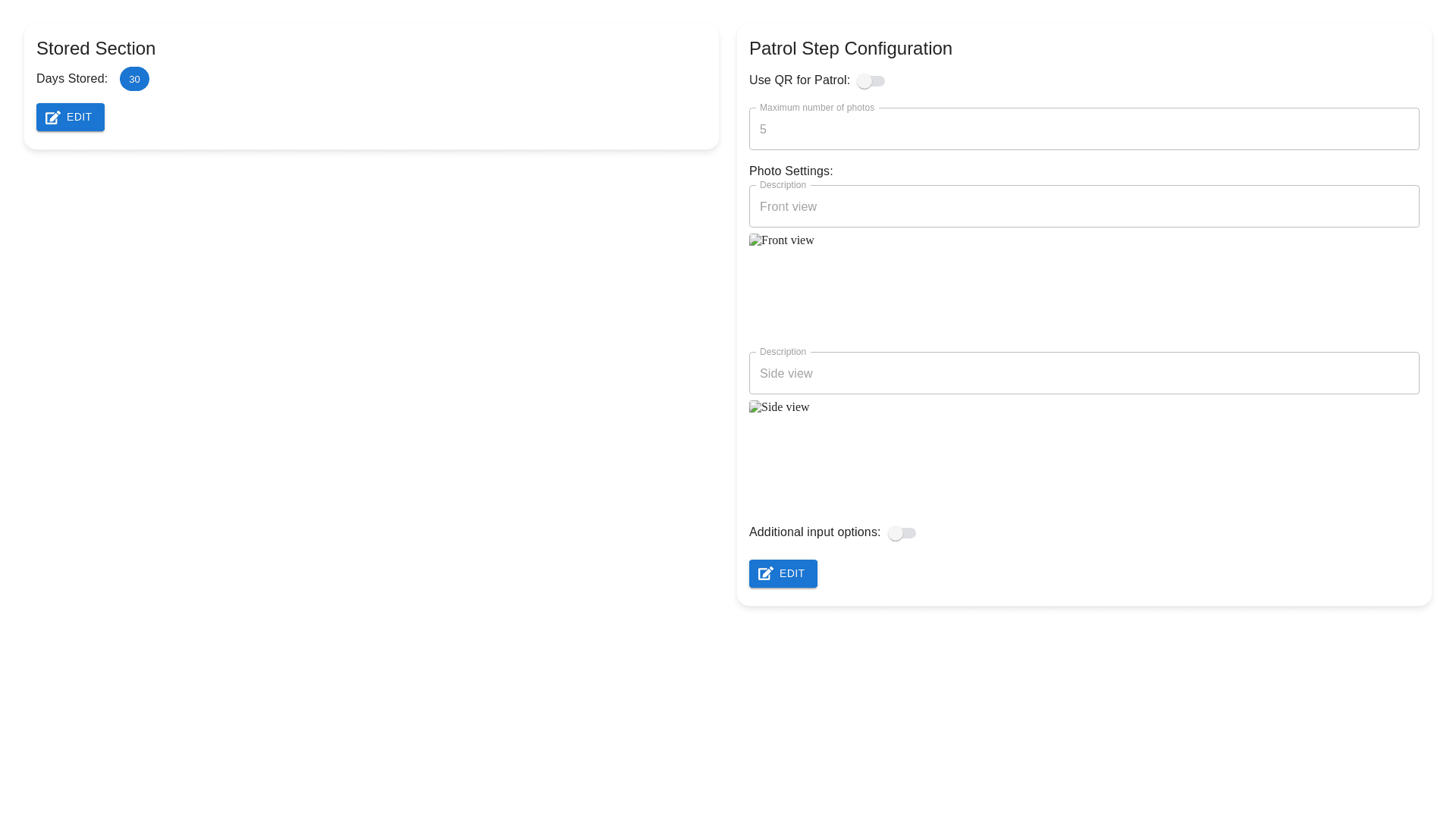
Create a user interface with two distinct sections, each separated by a clearly defined block. Both sections should initially be in 'view only' mode, displaying the information with no editing options. Each section should have an 'Edit' button, and upon clicking this button, the corresponding section should switch to an editable component. 1. **Section 1: Stored Section** Display the number of days a bicycle is stored, in a read only format. This section will contain a numeric value that shows the storage period in days. 2. **Section 2: Patrol Step Configuration** This section will include: A toggle switch for 'Use QR for Patrol', where the user can select either 'True' or 'False'. If 'True' is selected, QR codes will be used, and if 'False' is selected, they will not. A numeric input field for 'Maximum number of photos', allowing users to specify the maximum number of photos that can be taken during patrols (example: 5, system limit is 20). A photo setting area where the user can view 'Description' (the purpose of the photo) and 'Image' (displayed as an uploaded image thumbnail). Include a '+' button in this area that, when clicked, allows the user to add a new record for uploading additional photos and entering descriptions. A toggle switch for 'Additional input options' where users can choose to add more fields beyond the default ones during patrols. Example fields include vehicle type, registration number, and color. Each section should transition from 'view only' to an editable state with the proper input fields when the 'Edit' button is clicked.