Lynx Dashboard - Copy this React, Tailwind Component to your project
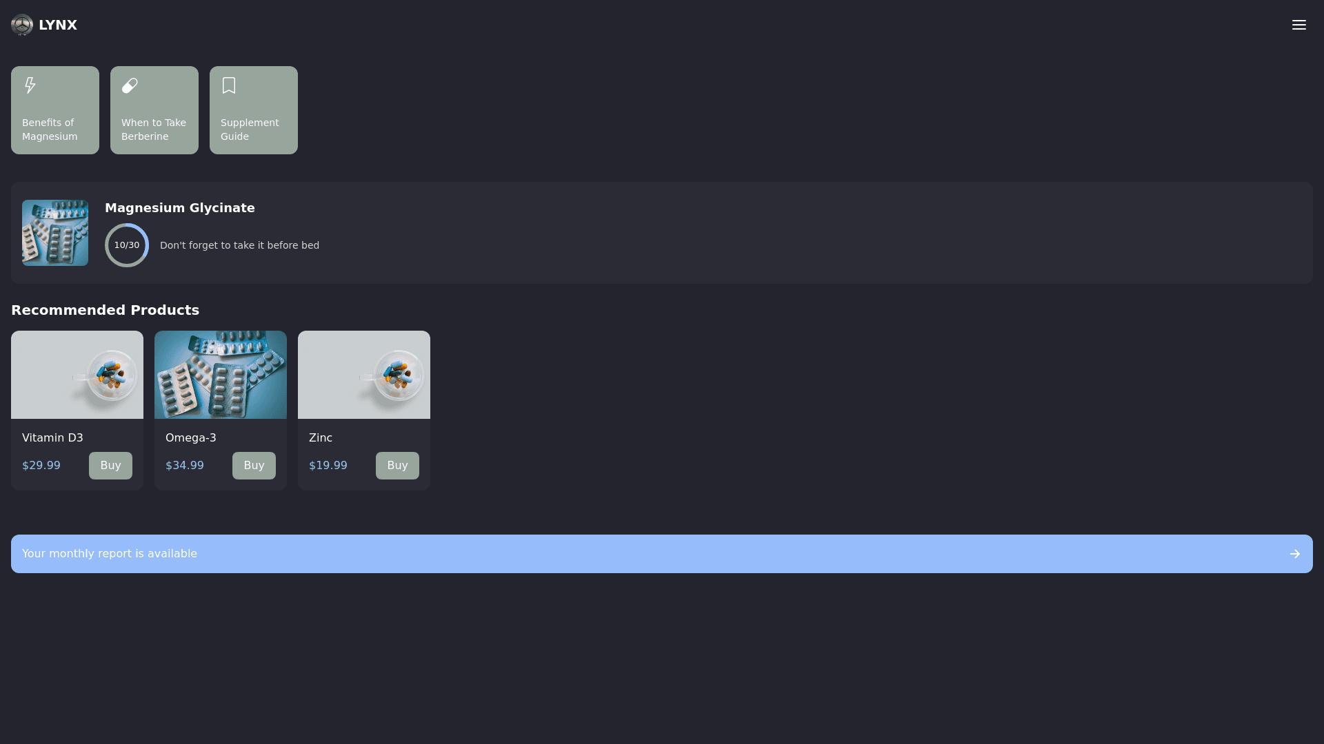
Create a personal dashboard interface for a premium web application called LYNX. The design should focus on simplicity, elegance, and user friendliness, with a modern and premium feel. Use a dark background (#23242d) and accent colors (#98a59c, #97bcfc). The interface is for managing dietary supplement courses. At the top, include a header with the LYNX logo on the left and a hamburger menu on the right for navigation to profile and settings. Below the header, place a section with interactive story style buttons, each leading to brief articles such as “Benefits of Magnesium” or “When to Take Berberine.” These stories should be styled as visually engaging cards with small icons or illustrations. In the center, add a slider showcasing the user’s current supplement. On the left side of the slider, display a bottle image. On the right, use a circular progress indicator showing days taken versus days remaining (e.g., “10/30 days”). Below the progress indicator, include a short reminder, like “Don’t forget to take it before bed.” Further down, include a slider catalog featuring other products available for purchase. Each product card should have a clean design, with an image and a prominent “Buy” button. Finally, add a recap section with a button labeled “Your monthly report is available.” When clicked, it should open a report in a story like format consisting of three to four screens summarizing changes and recommendations. The overall design should use modern fonts such as Inter or Roboto, with a clean and uncluttered layout that prioritizes readability and visual balance. The interface should exude sophistication and align with the premium positioning of the LYNX brand.
