Styled Header - Copy this React, Mui Component to your project
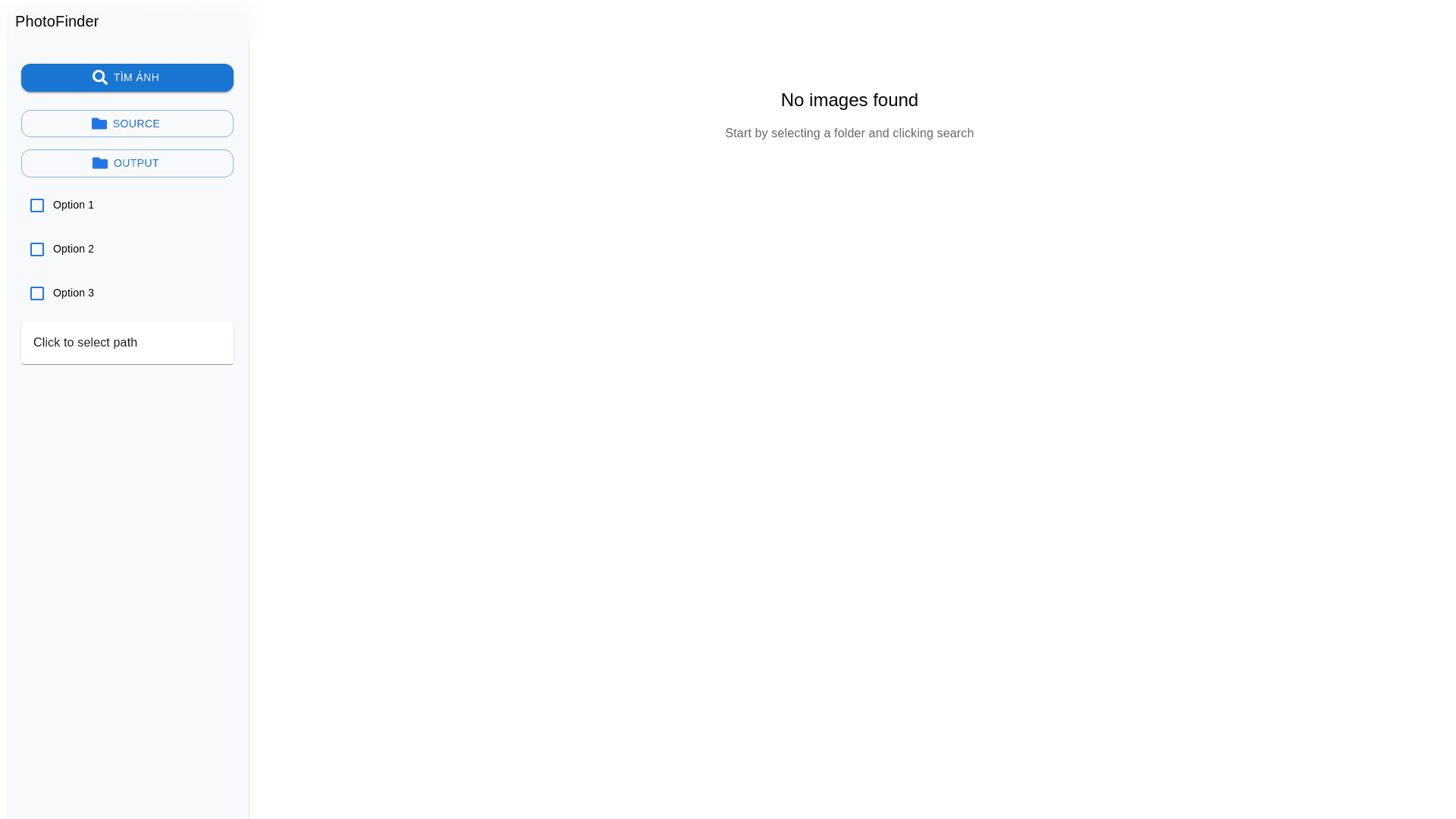
Tạo React component cho PhotoFinder app với thiết kế minimal, trong suốt kiểu iOS kết hợp Google Photos. Sử dụng MUI v5, layout một trang với sidebar trái và main content phải. LAYOUT: Header: Chiều cao 56px, nền trong suốt với blur effect, logo "PhotoFinder" căn trái, font SF Pro Display. Sidebar: Chiều rộng 280px, nền #f8f9fa với opacity 0.95, border right mỏng #e0e0e0. Main content: Phần còn lại của viewport, nền #ffffff với opacity 0.98. COMPONENTS CHI TIẾT: 1. Sidebar Components: Search Button: Nút "Tìm ảnh" lớn ở trên cùng, style primary filled, border radius 12px, icon search, hover effect subtle Folder Buttons: 2 nút chọn folder (source & output) với icon folder, style outlined, màu #1a73e8 Checkboxes: 3 checkbox với animation smooth, màu #1a73e8, ripple effect nhẹ Path Display: Hiển thị đường dẫn với text ellipsis, hover hiện tooltip, click để mở modal 2. Main Content: Empty State: Khi chưa có tìm kiếm, hiển thị illustration và text gợi ý Progress State: Khi đang tìm, hiển thị progress circular style iOS Result Grid: Sau khi tìm xong, hiển thị grid ảnh với hover effect và animation fade in Report Panel: Panel thông tin kết quả với các metrics, style card trong suốt THEME COLORS: Primary: #1a73e8 (Google Blue) Background: #ffffff (iOS White) Surface: #f8f9fa (Google Gray 50) Text Primary: #202124 (Google Gray 900) Text Secondary: #5f6368 (Google Gray 700) Accent: #34a853 (Google Green) ANIMATIONS & EFFECTS: Hover: Scale transform 1.02, transition 200ms Click: Ripple effect với opacity 0.1 Loading: Smooth progress animation Transitions: All component transitions 250ms ease in out FEATURES: Drag & Drop zones với border dashed khi hover Auto save preferences vào localStorage Real time progress updates Responsive layout với breakpoints ERROR HANDLING: Toast notifications style iOS Error states với subtle red highlights Loading skeletons khi fetching MODAL & DIALOGS: Background blur effect Rounded corners 16px Slide up animation Backdrop với opacity 0.5 CODE STRUCTURE: Viết liền mạch, tối ưu, không xuống dòng không cần thiết. Sử dụng styled components cho CSS. TypeScript cho type safety. Đầy đủ comments giải thích logic. RESPONSIVE BEHAVIOR: Mobile: Sidebar collapse thành drawer Tablet: Sidebar width 240px Desktop: Sidebar width 280px ACCESSIBILITY: ARIA labels đầy đủ Keyboard navigation Focus indicators rõ ràng Yêu cầu code output: Một file TypeScript duy nhất, có thể copy paste trực tiếp để sử dụng. Bao gồm tất cả imports, types, và component implementation.