A
Anonymous
Popover - Copy this React, Tailwind Component to your project
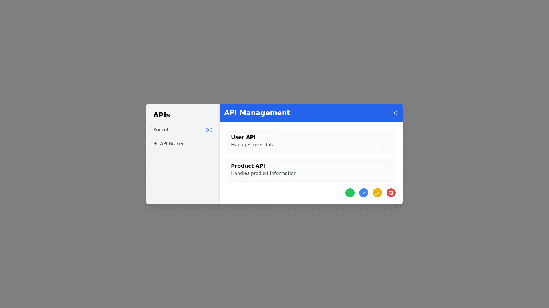
Create a Popover Component Structure: Title Bar: Display a title. Include a close button on the right. Sidebar (Menu): Title: "APIs". Below the title, include: A toggle icon for enabling/disabling the socket. An icon and name for the API broker. API List: Display available APIs in a list format. At the bottom of the list, include the following action buttons (all represented by icons): Add Save Edit Delete Form Display: When clicking "Add" or "Edit", show a form to: Add a new API or Edit an existing API.
Prompt