Drawer Width - Copy this React, Mui Component to your project
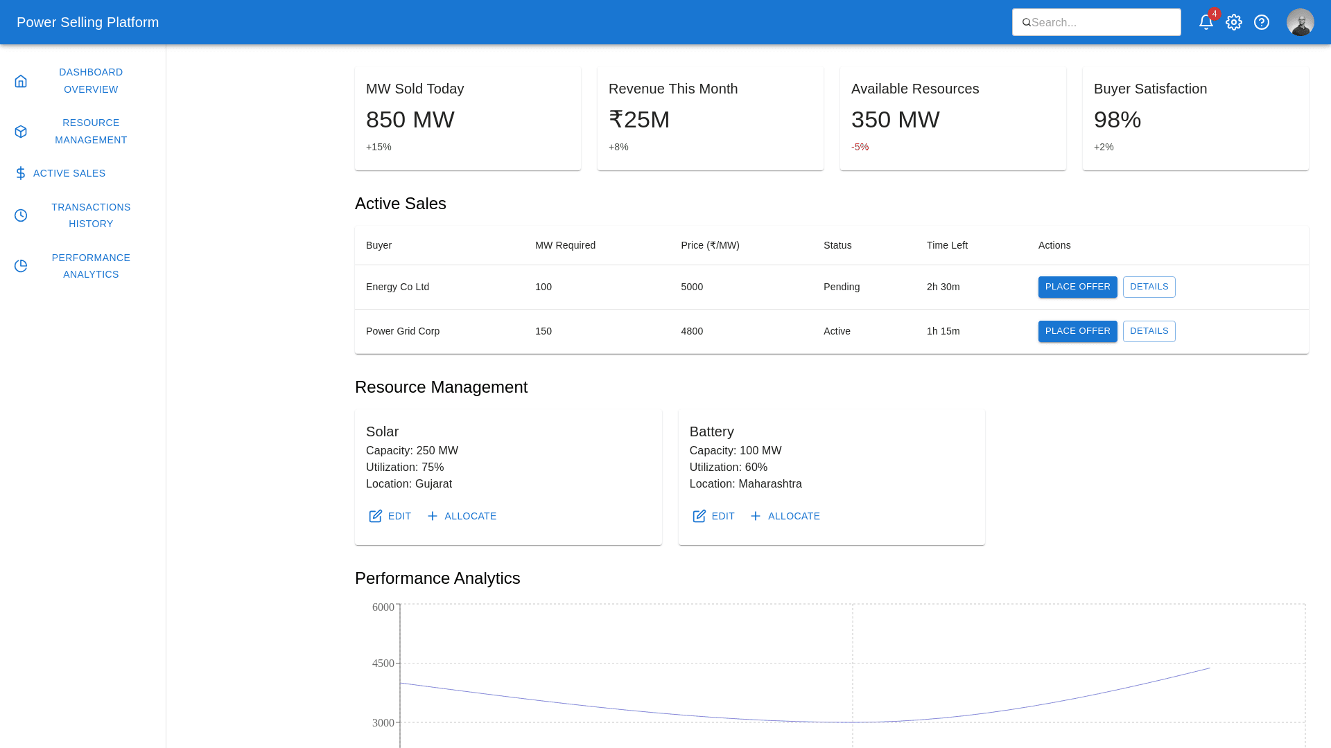
"Design a modern, intuitive, and professional Power Selling Dashboard wireframe tailored for stakeholders involved in energy flexibility and demand response management. The dashboard should simplify the selling process, enable resource tracking, and provide real time insights to maximize operational efficiency and transparency. Key Functionalities to Include: 1. Navigation Bar (Vertical, Left Aligned): Tabs: Dashboard Overview Resource Management Active Sales Transactions History Performance Analytics Notifications Include clear, descriptive icons with text labels for each tab. Ensure a collapsible option for space optimization. 2. Header Bar (Top, Horizontal): Display branding (platform name/logo) on the left. Include a Search Bar for quick navigation. Add icons for Notifications, Profile Settings, and Support Helpdesk on the right. Provide real time status: “Active Transactions,” “Pending Offers,” or “Sales Completed.” 3. Key Metrics Section (Top of Main Area): Highlight critical metrics in info cards: Total MW Sold (e.g., “850 MW Sold Today”). Revenue Generated (e.g., “₹25M Revenue This Month”). Available Resources (e.g., “Solar: 250 MW, Battery: 100 MW”). Buyer Satisfaction Score (e.g., “98% Positive Feedback”). Use green/red indicators to show performance trends (e.g., ↑5% or ↓3%). 4. Active Sales Section: Display active sales opportunities in a grid or table format: Columns: Buyer Name (or DISCOM) MW Required Offer Price (₹/MW) Bid Status (Active/Closed) Countdown Timer (for time limited offers) Include Filters: By buyer, region, resource type, or bid status. Interactive buttons: “Place Offer” or “View Details.” 5. Resource Management Section: Use a card layout for available resources (solar, batteries, EVs): Each card should display: Resource Type Capacity (MW) Current Utilization Location Interactive buttons: “Edit Resource”, “Add Resource”, “Allocate.” 6. Transactions History Section: Provide a sortable table for all past transactions: Columns: Transaction ID Date MW Sold Revenue (₹) Buyer Name Status (Completed/Failed) Add filters for time period, buyer, and resource type. Include a Download Report option. 7. Performance Analytics Section: Visualizations for actionable insights: Line Chart: Revenue trends over time. Bar Chart: Resource usage breakdown (e.g., solar vs. battery sales). Pie Chart: Sales distribution by buyer region or type. Highlight key trends with tooltips for detailed information. 8. Notifications Panel (Right Sidebar): Display alerts for: New buyer requests. Resource allocation updates. Transaction status changes. Allow users to mark notifications as read or set priority levels. Design Style and Visual Guidelines: Color Palette: Professional tones (blue, green, gray, and white) with accent colors for alerts (yellow/red). Typography: Modern and legible fonts like Roboto or Open Sans. Icons: Use intuitive, energy themed icons for navigation and metrics. Interactivity: Ensure hover effects, tooltips for metrics, and click actions are prominent. Output Expectations: Wireframe Layout: Clearly display the navigation bar, header, main content area, and sidebar notifications. Detailed Sections: Include a clear representation of the dashboard’s key metrics, tables, visualizations, and interactivity. Responsive Design: Show adaptability for desktop and tablet screens. This wireframe should enable stakeholders to easily navigate sales opportunities, manage resources, and track transaction outcomes with real time insights. Focus on simplicity, clarity, and functionality."