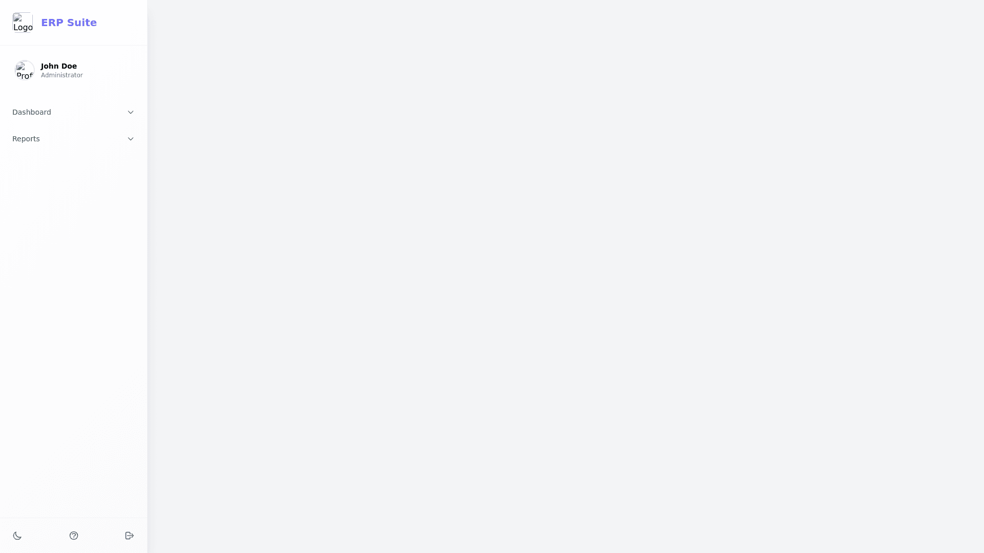
Premium Animated Sidebar - Copy this Html, Tailwind Component to your project
Design a premium animated sidebar for a modern ERP dashboard with the following features: Theme & Style: Use a light gray theme as the base, with smooth gradients and clean UI elements for a contemporary look. Add subtle gradients in the background (e.g., light gray fading to off white or a faint pastel tint) for a premium feel. Include animated dropdown menus for navigation sections, with smooth expand/collapse effects (e.g., ease in out animations or Material Design inspired motion). Typography: Utilize modern, sans serif fonts like Inter or Roboto for clarity and elegance. Add slightly bolded text for headings and regular weight for menu items. Color Palette: Base: Light gray (#F4F4F9) with subtle shadows. Accent: Soft pastel tones (e.g., baby blue, mint green, or peach) for highlights and hover effects. Gradients: Use gradients for active states (e.g., linear gradient(90deg, #A1C4FD, #C2E9FB) for menu items). Icons: Muted but elegant colors like charcoal gray (#555) with hover effects using soft accent shades. Structure: Header: Small logo section with the app name in bold, premium typography. Include a user profile widget with a circular avatar, name, and a dropdown for quick actions (e.g., "Profile," "Settings," "Logout"). Navigation Menu: Group items into sections (e.g., "Main Menu," "Reports," "Settings"). Each section includes animated dropdowns with a smooth expand/collapse effect. Add hover effects: subtle scaling of icons, gradient text highlights, or a glowing underline for the active item. Use modern Material Design icons for visual cues. Footer: Include small, interactive buttons for options like theme switching (light/dark toggle), help, or logout. Use gradients or light accent colors for call to action buttons. Advanced Features: Hover Effects: Add glowing shadows or animated borders when hovering over menu items. Interactive Animations: Dropdown menus expand with smooth, staggered animations for child items. Subtle transitions for active states (e.g., a slide in gradient highlight bar). Micro interactions: Icons or menu items slightly "pop" on hover or tap with a gentle scale animation. Tooltips: Add descriptive tooltips for menu items when hovering over collapsed or icon only states. Responsive Design: Collapsible sidebar for smaller screens, with an animated hamburger menu icon. Adjustments to spacing and typography for tablet and mobile views. Extras for Premium Look: Use glassmorphism effects for a partially transparent sidebar background. Incorporate 3D like effects on hover (e.g., slight depth shadows). Add scroll animations for sections with many items (e.g., smooth scrolling with custom scrollbars). Overall Goal: The sidebar should feel interactive, lightweight, and luxurious while maintaining a clean, professional, and highly functional design. Use soft animations, gradients, and subtle motion to create a dynamic and visually engaging user experience.
